Posted on 1 Comment

Fabric design collections – Masala

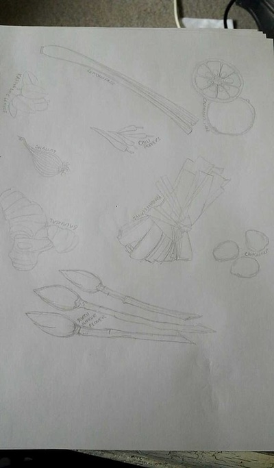
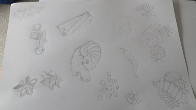
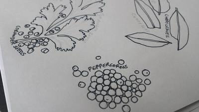
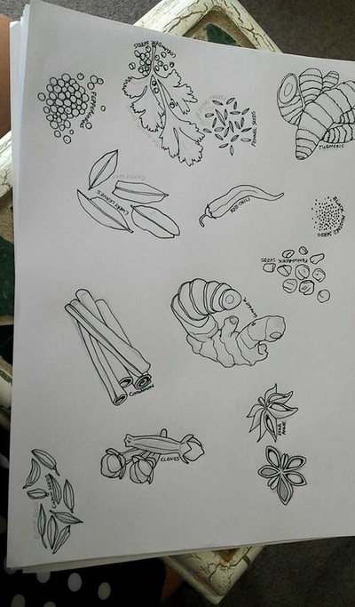
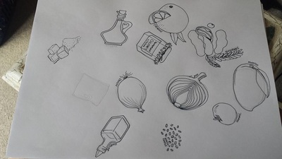
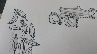
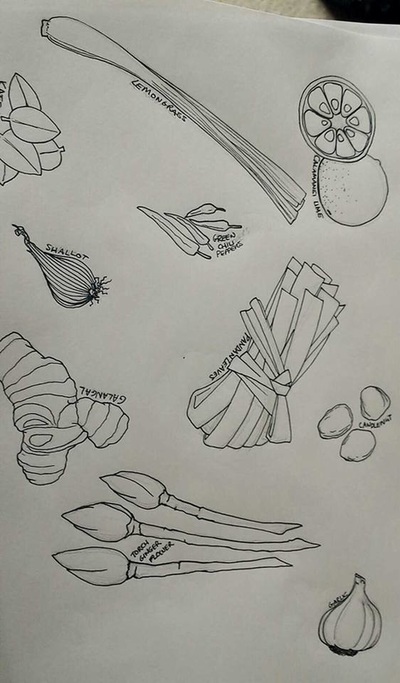
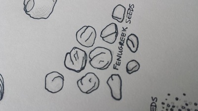
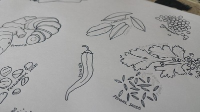
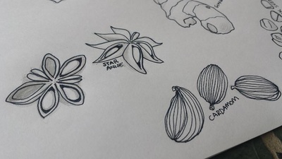
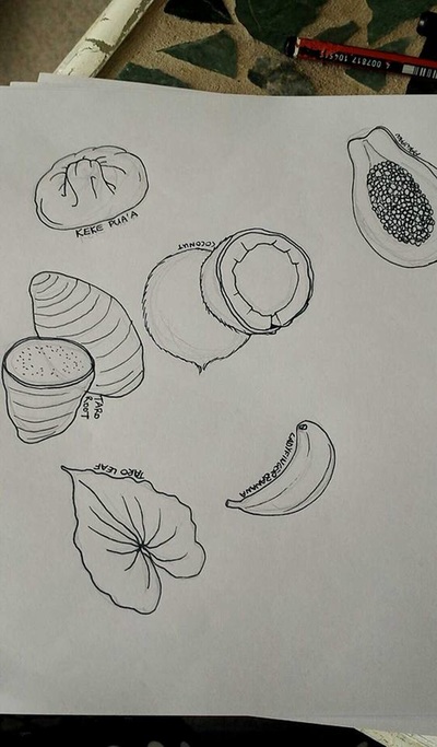
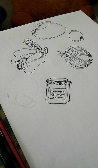
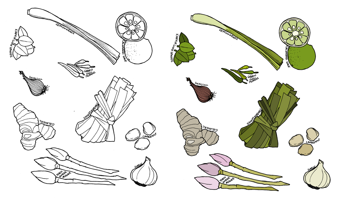
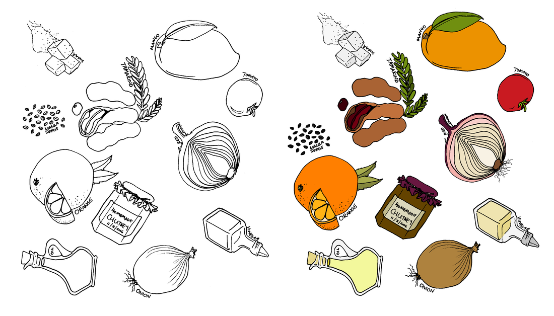
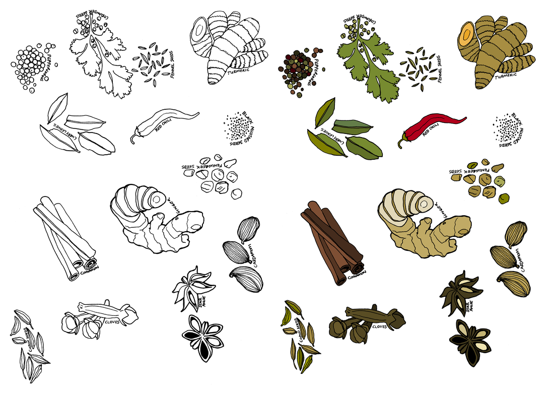
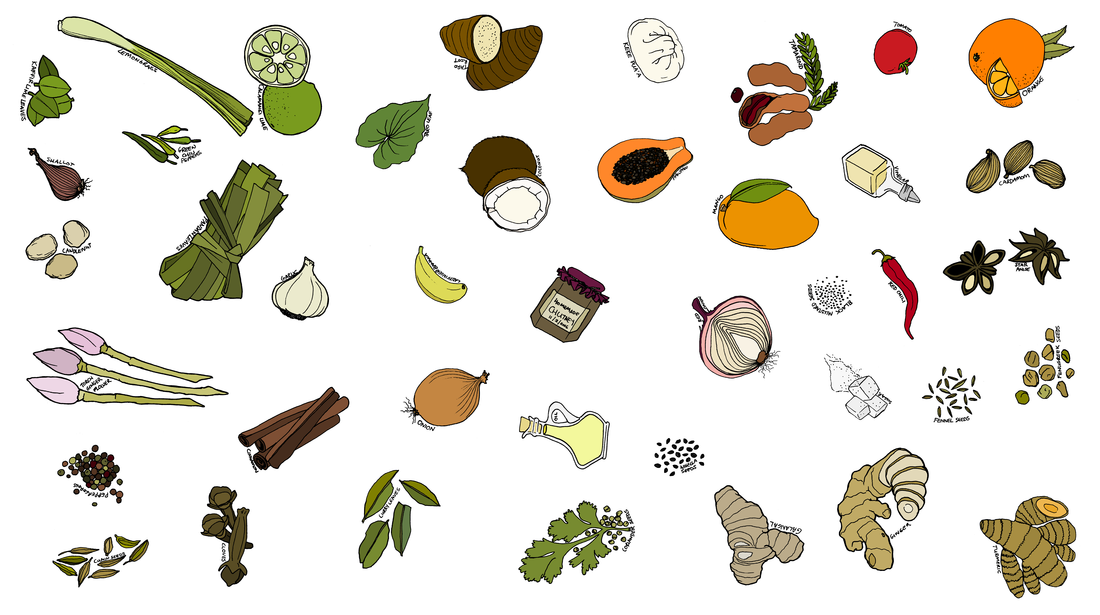
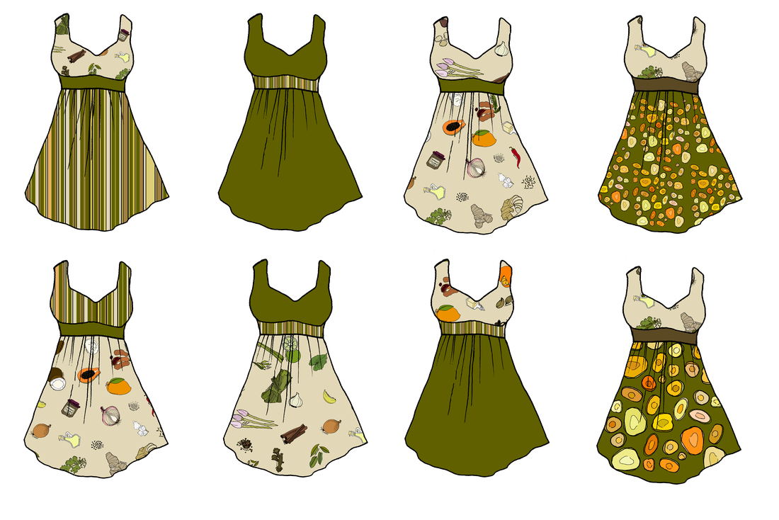
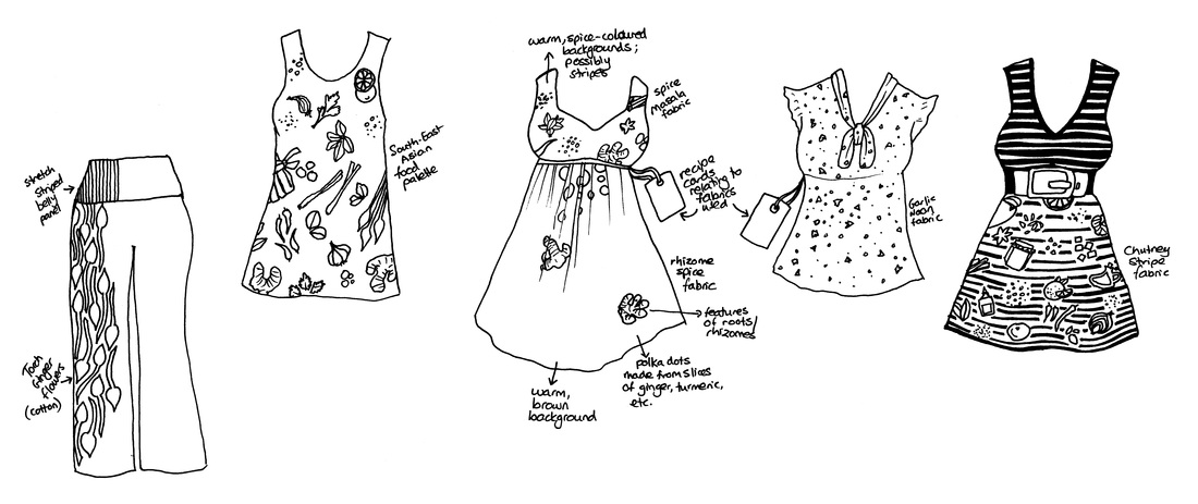
This collection came about as I started doodling ideas for some fun and quirky fabric. I decided to inspire myself with recipes. I started by looking up curries, spice mixes (hence the name, ‘masala’), and chutneys, then moved on to look for ingredients in South-East Asian and Polynesian cooking.
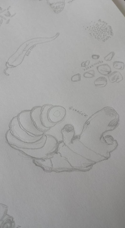
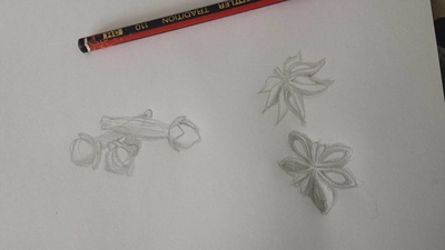
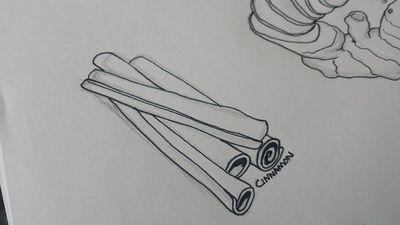
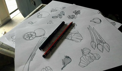
I initially thought I was going to have several different designs, but the ingredients looked really good when they were all combined into one image.
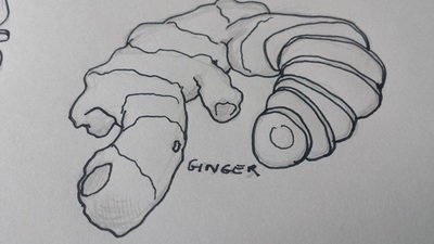
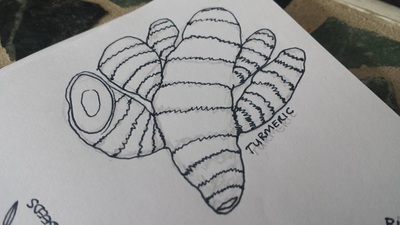
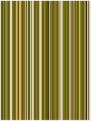
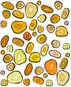
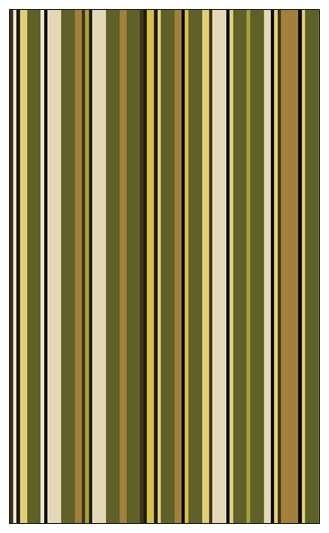
From this original concept, I extrapolated a stripe, using the previous technique of a word in barcode font, and a polka-dot based on sliced rhizomes (ginger, turmeric, etc.)
Posted on Leave a comment

Plus-size problems

A while ago, I started thinking about what I really wanted to wear. Pretty quickly, words like ‘eclectic’, ‘fun’, and ‘quirky’ started flying around. But you can’t really get fun plus size clothes, can you? Well, you can – but they often end up looking like a costume unless you really own the look. One example is the amazing Rockabilly fashions that have been appearing over the last few years – amazing, fun, and flattering for us curvier shapes – but they’re from a time when women regularly spent a lot more time on their appearance, and they require a great deal of commitment. 
That’s not really practical for everyday clothing.
Then, I started thinking about how I would make a corporate steampunk line – I designed my wedding outfits, and learnt a lot about plus size fashions in the process – for example, we need MUCH longer tops than you would expect, even under a corset! Corporate steampunk would require some really structured lines, and a lot of fabric in each garment. Again, this type of clothing wasn’t terribly practical for grab-and-go workday wear, and the couture aspect required a higher level of design experience than I currently have in my portfolio – so that idea got shelved, too.
So what did I mean by ‘fun’ workwear?
I sat down and did some Googling, and I established that what I really meant was something that let me buy my basics like black pants, simple leggings, cheap tops, and dress them up with accessories that made them into something more – I wanted adorable but comfy shoes; clever, flattering belts; light little jackets that gave me a shape; and the occasional piece of feature clothing that I could mix and match with my basics. That could be a cute dress that I could wear with a long-sleeved shirt and leggings in winter; a blouse to dress up my boring black pants; a little stretchy skirt to make me feel happier about wearing tunics or shorts with leggings; and most importantly, and elusively, something to pull in the sack-like plus-size tops in a way that would flatter me and give me a shape, without being too uncomfortable to wear at my desk all day. 
So, where is this heading, I hear you ask?

What is my shape?

In classic body shapes (apple, pear, etc.), I think I’m somewhere between hourglass and rectangle. This sounds impossible, but that’s the thing with plus sizes – once you start putting more weight on someone’s frame, they carry it differently. So, how do I express that? 
I looked at the different plus-size websites, and they were all too diplomatic to be really clear. 
Here’s an example from the Lane Bryant website, which has three collections of pants – the ‘Lena’, the ‘Ashley’, and the ‘Sophie’. This is from the ‘Sophie’:

FOR SHAPES THAT ARE FULLER IN THE WAIST AND STRAIGHTER THROUGH THE HIP AND THIGH.

But what does that even mean? I couldn’t get any of the words to match my shape, and the models all seemed to be used interchangeably. There were no clear guidelines, measurements, or graphics to help me choose, and none of the models had bellies, so I couldn’t get any guidance from there. I decided that I would start with identifying a new shape for myself, and then going from there to figure out what clothing might flatter my own shape. Then, I could use that as a benchmark to try to identify more shapes and the cuts of clothing that would work for them.

What do I like to wear?

So, if I was going to start with my own shape, I needed to figure out what parts of it mattered, in terms of flattering cuts and comfort, so I started by thinking about what things I like to wear, and what things I don’t.
I like simple clothes. I like layers, but only hen it’s really cold. I get warm too easily, otherwise. I don’t like tops made of such thin fabric that you have to wear another layer underneath. I like jeans, and belted blouses and tunics. I like Ponte di Roma pants, and leggings, and things with stretch that doesn’t confine.
I like fit-and-flare dresses, because they flatter me, but I don’t like wearing them, because the skirts, by their very nature, flare – they’re annoying in the car, they’re uncontrollable in the Wellington wind, and they make everything just a little bit more unmanageable. On top of that, they make me look and feel ‘dressed up’ – so, while I love the way dresses look, I would need to practise wearing them to get comfortable. Then, there’s the fact that they show my legs – so I would need to wear leggings or tights, and the right kind of shoes, and yikes, this is hard.

What *would* I like to wear?

The thing that I find myself searching for the most often is something to work like a comfortable corset – give me shape, but be more structured than a belt, without cutting off circulation or preventing me from taking a deep breath. This seems like a really simple thing, but it’s turned out to be the most complex of all – how exactly to design something I pull over my head, that still looks as structured as a waistcoat, as simple as a belt, and as flattering as a corset, whilst being as comfortable as a vest?
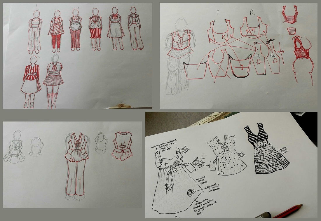
So, I started scribbling…
Pretty soon, I had narrowed it down to a few garments that I thought would work well – high-waisted, fold-over pants; a tunic that can be worn with or without a belt; a fit-and-flare dress, but without too much fabric in the skirt, and a stretchy bodice; and a flounce-sleeved, pussy-bow blouse.
Based on these sketches, I started drawing some ideas for fabric designs, which became the Masala Collection. Now, I knew what I wanted to have made to fit me, and what kind of look those clothes might have. I was underway!
Posted on Leave a comment

‘Stationery’ and moving

That’s right, we’ve got a logo, a nifty little tagline, and now, business cards! As the Geordie Shore lot like to say, GET IN!

The saga of the logo

The logo has been a bit of an adventure, actually.
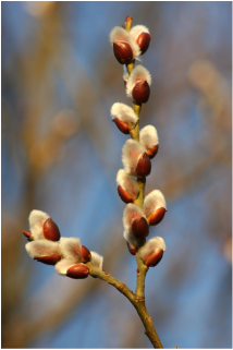
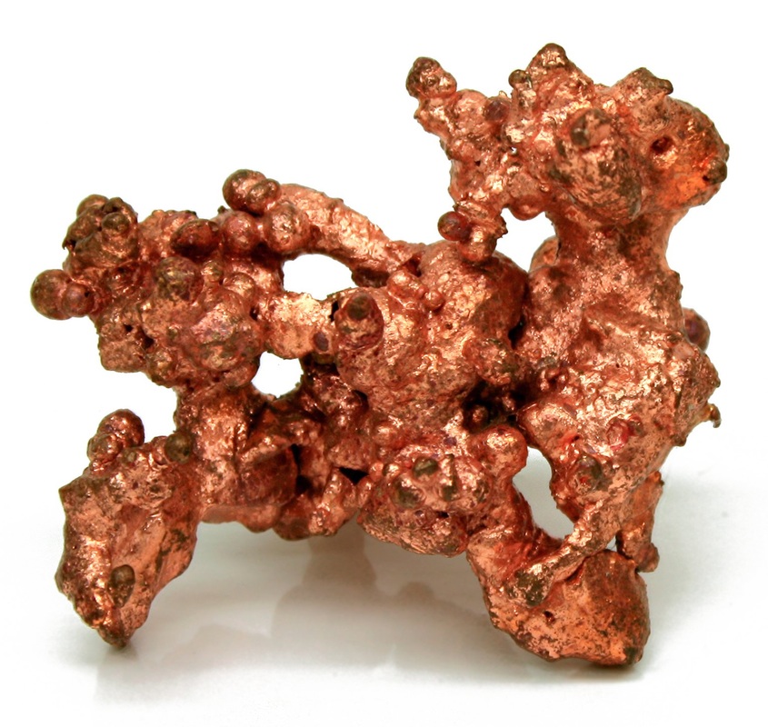
I came up with the ‘Copper Catkin’ part of the name some time ago – the contradiction appealed to me – the fluffy catkin, made of shiny metal. I chose copper as a nod to my interest in all things Steampunk, and I have loved catkins since I was a wee kitling myself.  The combination plant and metal is also a quiet nod to NZ’s silver fern.
As I played with the name, I knew I was at risk of choosing another name that didn’t reflect my brand, which was something people commented about with Phersu Dancing.
I tried adding in a third word – ‘Copper Catkin Clothing’? ‘Copper Catkin Creations’? ‘Copper Catkin Compulsion’? ‘Clothing by Copper Catkin’?  I just couldn’t get the name to gel correctly.
As I always do these days, I talked it out with my husband – and he came back with a really clever suggestion.
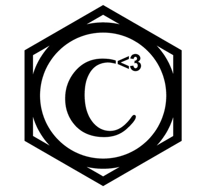
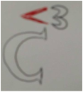
There are 3 ‘C’s in Copper Catkin (even if there’s no third word in the name, there’s my name, Cat – and that’s what we eventually went with). As a man with a mathematical bent, George saw that as C cubed – or C to the power of 3. But he didn’t stop there – he knows that I love using emoticons, so he chose the heart (<3) to go with the ‘3’ . It was a particularly meaningful choice for me because we have a running, cutesy joke about sending each other little hearts, and making cheesy hearts with our fingers, like this:
So it was a short step from there to incorporating the heart emoticon in the logo. He scribbled a quick draft, and I loved it.
ts’s actually remarkably hard to design your own stuff, just like it’s hard to sort your own larder, choose your own paint colour scheme, or draw your own tattoo. I think sometimes, you can simply be too close to something, and it becomes both overwhelming, and too important to do yourself. I know that as soon as I have finished something, the first think my critical brain starts doing is picking it apart – so I knew that I needed to get someone else to do the logo design for me. I had great success asking Lisa Park to design my new look for Phersu Dancing Designs, and I will continue to use that brand for my jewellery, so I definitely wanted to use a professional designer for my Copper Catkin branding. This time, I’m really trying to source as much as possible locally, in NZ – and Lisa is in Australia. So, I approached a designer that I knew through a mutual friend, also called Cat, from Byte Design. Unfortunately for me, Cat was flat tack with some major projects, but she steered me to try out the Fiverr services. Given that I didn’t really know what I wanted, either, I decided to take a punt, and it was really useful – for a very small amount of money (a literal fiver – $5US) – you can have someone take your ideas and turn them into a logo!
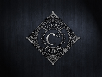
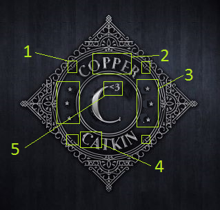
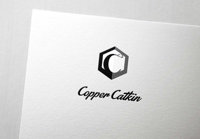
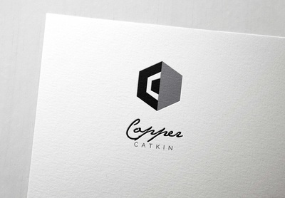
The first person came back to me with figure 1, above. With the help of Cat from Byte Design, I identified what was bugging me about it, and sent it back. My favourite part was her quick mock-up, figure 2, which showed the superscript heart emoticon replacing the ball serif on the ‘C’. 
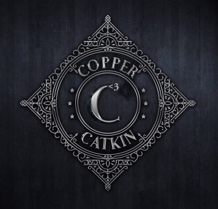
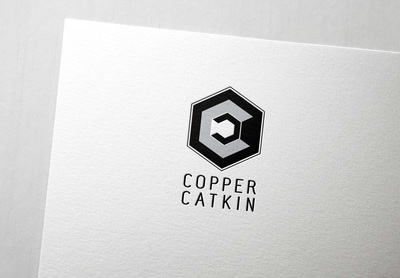
I sent it back for review, as per figure 3, and got these options:
I love them – they’re ornate, pretty, and they *almost* match my requirements. But the very fact that they’re ornate works against them for everyday use. I need something simple, most of the time. So, I tried again. This time, I knew something else – after a wander around the mall, I discovered that Copper Catkin, as a brand, really identifies with hexagons. I don’t know why. it just happened. So, I made this as a mock-up, and sent it to my second Fiverr designer to ‘polish up’.
Once again, it was worth the small outlay to help me further refine what I didn’t want. It was back to the drawing board, but this time, I had a much stronger sense of the logo – and a husband kind enough to help me extract that idea from my brain! We came up with these options.
It turns out that all I actually wanted was a thicker, rounded outline for my simple logo. *sigh*

The tagline

It turns out that the logo was acting like a sort of bottleneck for my creativity in relation to Copper Catkin. Once I had a logo, everything else kind of fell into place. I was thinking that I wanted something with its own, quirky character. Every time I brainstormed, ‘quirk’ came up. Then, it clicked – I’m talking about corporate clothes with a touch of fun, right? And I want my ladies to ‘work it’, right? Feel great, feel different, express who you are without getting fired? Perfect! #workyourquirk was born 🙂

The business cards

Suddenly, with the tagline, it all came tumbling out – and I was ready to design my business cards!
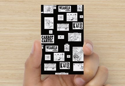
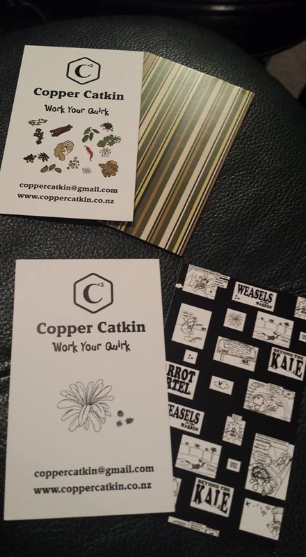
I decided to make one set for inclusion with the Wellington Rabbit Rescue fundraiser items, and another to go with my own pieces. I used designs from my Masala collection, inspired by Indian, South-East Asian, and Pacific recipes. 
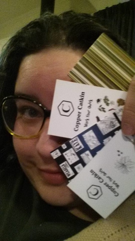
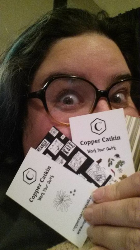
And now, they have arrived! #winning #workyourquirk 
Posted on Leave a comment

Hashtag First

In which something-or-other starts, and there are rabbits*

*The bit with the rabbits is further down
​So here we are then, I have finally got a name and a concept to start working with. I’ve been playing with some ideas for a while now, waiting for the tanks to refill after the huge creative burst that was our wedding
One of my biggest drivers has been trying to get back into the workforce after a really short break, only to find that there just isn’t anything out there in my size that doesn’t evoke the term ‘sack’ and a sad, resigned expression. 
What happened to big girls being beautiful? But surely, I hear you Wellingtonians say, there is an entire street full of plus-sized clothing in Central Wellington from which to choose (Featherston Street has a veritable cornucopia of designer plus-size stores). You must be able to find something to suit? Well, you’d think so – but actually, almost everything has a ‘sameness’ to it. All the bright colours are the same kind of bright, and the same shades. All the fabric patterns, from K-Mart to the designer stores, look like rejects from a discount store – too bold, too bright, unpleasant and unflattering designs and colourways. 
There’s the cheap and cheerful stuff from the Warehouse and similar chains, where you can get good basics, and horrifyingly unflattering sack-like ‘feature pieces’. 
There’s the drapey-hidey-slightly-more-shaped stuff from Zebrano, at the top end.
In between, there’s a lot of not-quite-fitting stuff, targeted at late middle-aged women who work in HR, leaving most of us younger women baffled, with our shopping bags filled with sadness and disappointment. 
But we have to have something to wear for work, and we can’t show up in pyjamas, so we are forced to buy what these stores offer – and we make it work.
But WHAT IF! What if we could find cool stuff, like slim girls can? What if there were cute outfits in flattering cuts, made of fun fabrics, and IN OUR SIZES? What if life didn’t have to be an endless litany of hitching up ill-fitting pants, adjusting falling bra straps, adding another safety pin to keep blouses closed, and feeling like a second-rate citizen?

I know that many of my Phersu Dancing customers were pleasantly surprised when I was able to supply them with jewellery that actually suited a ‘larger canvas’. I’m simply expanding on that concept with Copper Catkin – I’m designing fun things that I would like to wear, and working hard at finding local talent to help me get it out there to the masses. 

So that’s how I got to where I am today, in terms of launching Copper Catkin. More about the individual designs in future posts.
I’m excited to be working through my first revision of my first logo right as we speak – I will look at this process in another post. 
Now, I said there would be rabbits.


So when I bought a house with my now-husband, I also became a step-mother – as well as my own two cats, Responsibility (Billie for short) and her daughter, Shasha, I am now Mum to a dog, Lizzie, another cat, Loki, several self-seeded chooks that came with the new house (and the occasional flock of wild turkeys!), and three rabbits – Winston, Usagi, and Probably Beatrice. The cats are easy – they do cat things. The dog is immensely hard work for me, and I have been focussing all my energy on learning how to be a good goggy parent.

I can’t remember which of my rabbity friends ended up getting me into the Facebook group for Wellington rabbitry, but in no time, we were helping foster an adorable young bunny called Lily for Wellington Rabbit Rescue. As a foster-parent, I naturally became more interested in helping Wellington Rabbit Rescue raise funds to help cope with the influx of rabbits needing new forever homes, and here we are. 
For more information about Wellington Rabbit Rescue, click here for their Facebook pagehere for their Givealittle, and here for a recent article.

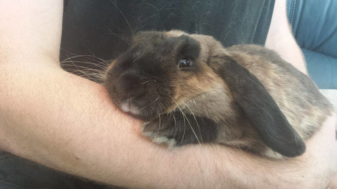
Here’s a picture of Lily being an adorable little snuggler <3

Now, I’m a bit of a soft touch for fundraisers – I often end up donating more time and product than I really should – but it feels great to try and help.
I remember the awesome feeling of camaraderie being part of the FeltAid craft for Christchurch movement after the first earthquake, It was only a drop in the bucket, but my donated artwork helped contribute towards around $2,000 of funds raised and donated to the Red Cross, so it was a really good thing that we did.

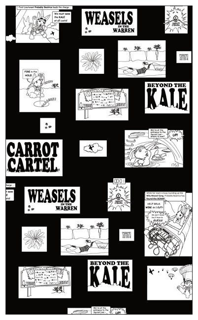
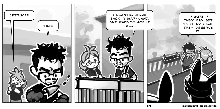
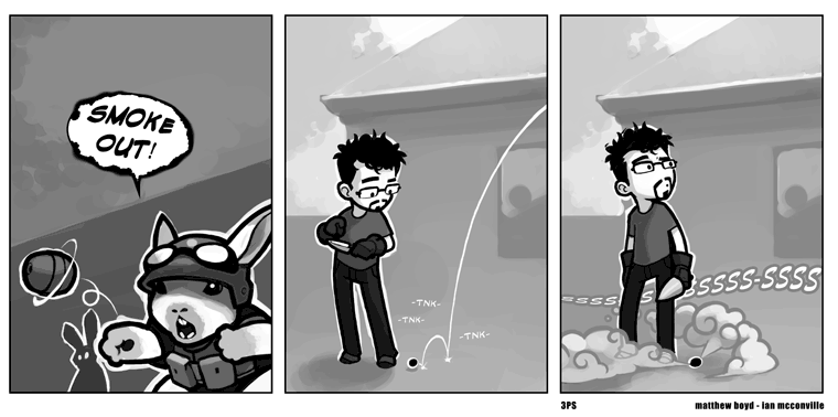
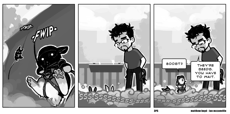
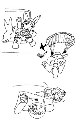
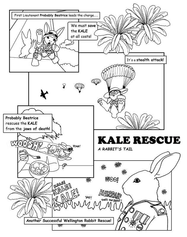
So when they called for someone to help with fundraising, I knew this was something I could help with. I immediately started work on brainstorming some ideas around ‘rabbit rescue’. My husband pointed me towards an online comic, Three Panel Soul, that he remembered from several years ago, which I used as inspiration (you can clearly see a couple of the poses were strongly modelled on this artist’s work, as I came to grips with the medium, having never drawn ‘action rabbits’ before. i’ve posted the three relevant panels from his site below – this is not my work.

Picture

My original sketches

Picture

First finished Rabbit Rescue page

I’m now working on two more pages – humans love the rule of three, and they love having choices, We’re considering doing the fundraising following a Kickstarter model, possibly via Kickstarter itself (just trying to interpret the rules). 
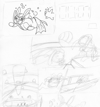
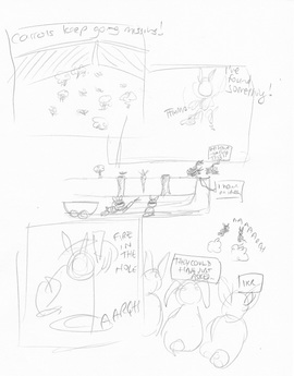
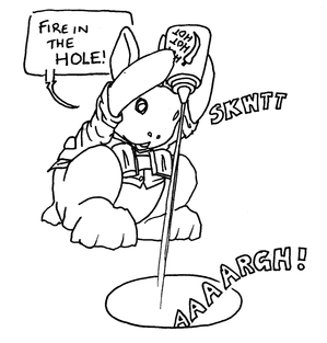
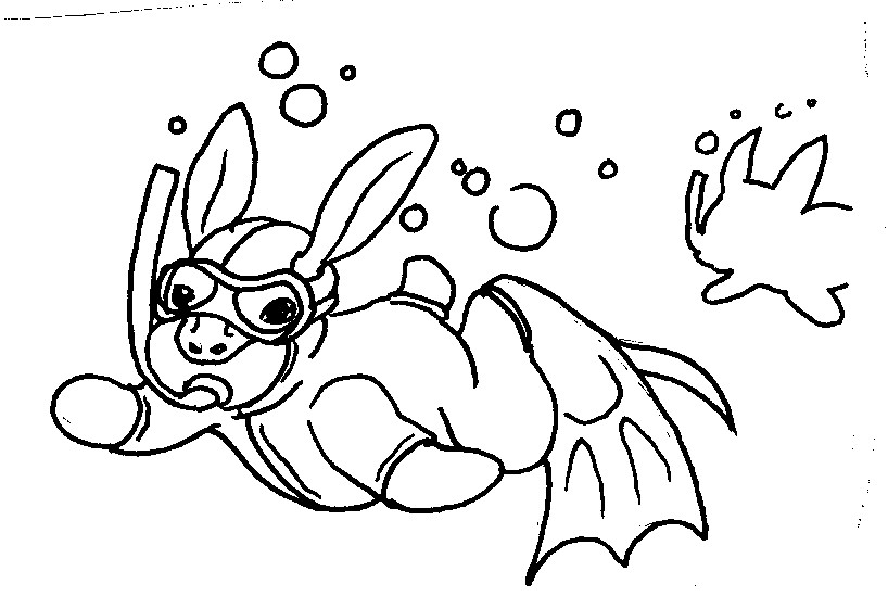
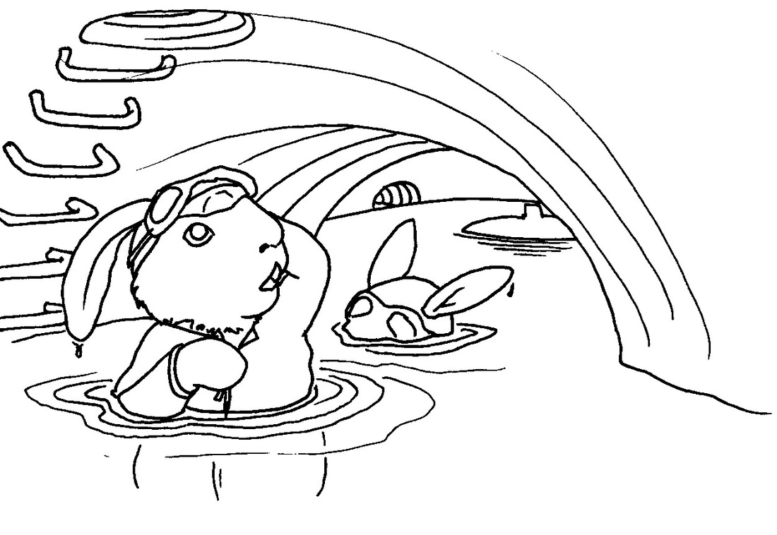
Here are a couple of my storyboarding efforts for the next pieces. We have some kind of underwater lair, with a countdown going on, and a carrot rigged to explode (but we can’t get the story detail into 3-4 panels, so we’re rethinking it), and a band of robber-rabbits foiled by judicious application of hot sauce.
The hot sauce picture is probably my very favourite of all the pictures I have drawn for this project, particularly because I am now getting enough of an idea of dynamic rabbit poses to have composed it entirely myself, as well – the only inspiration was the Expendables 2, which really didn’t have all that much too do with hot sauce – or rabbits – but definitely had a lot of action poses. 
I’m also enjoying my underwater rabbits. I hope I can weave them into a narrative somehow.