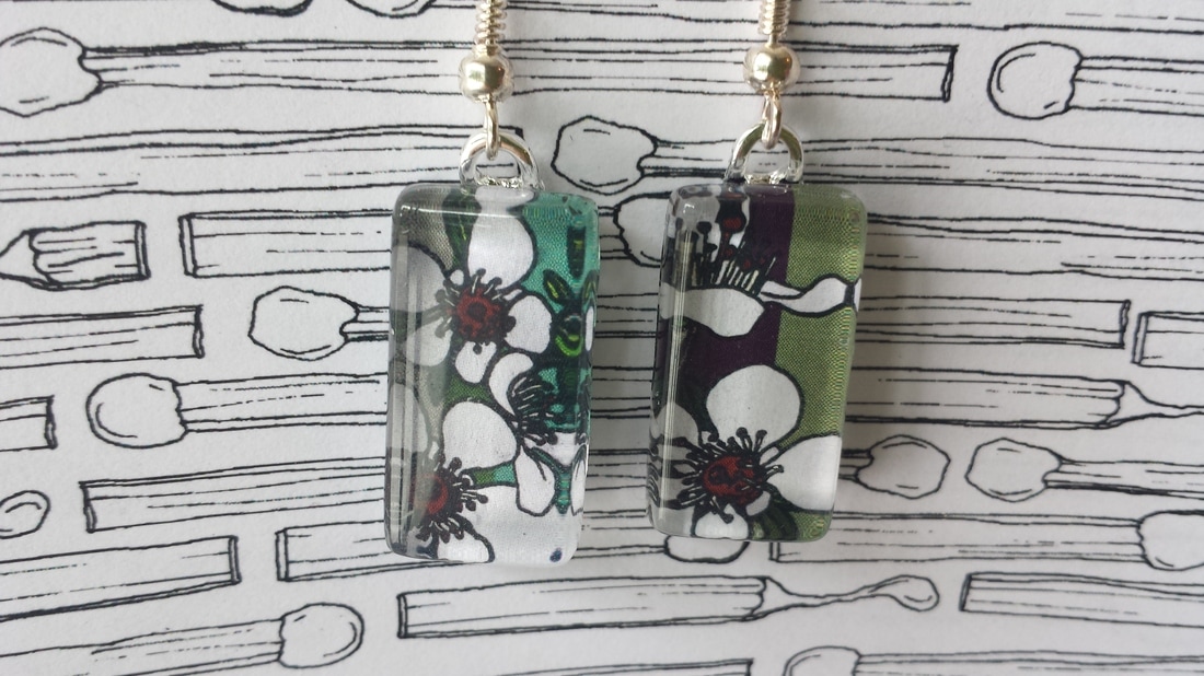
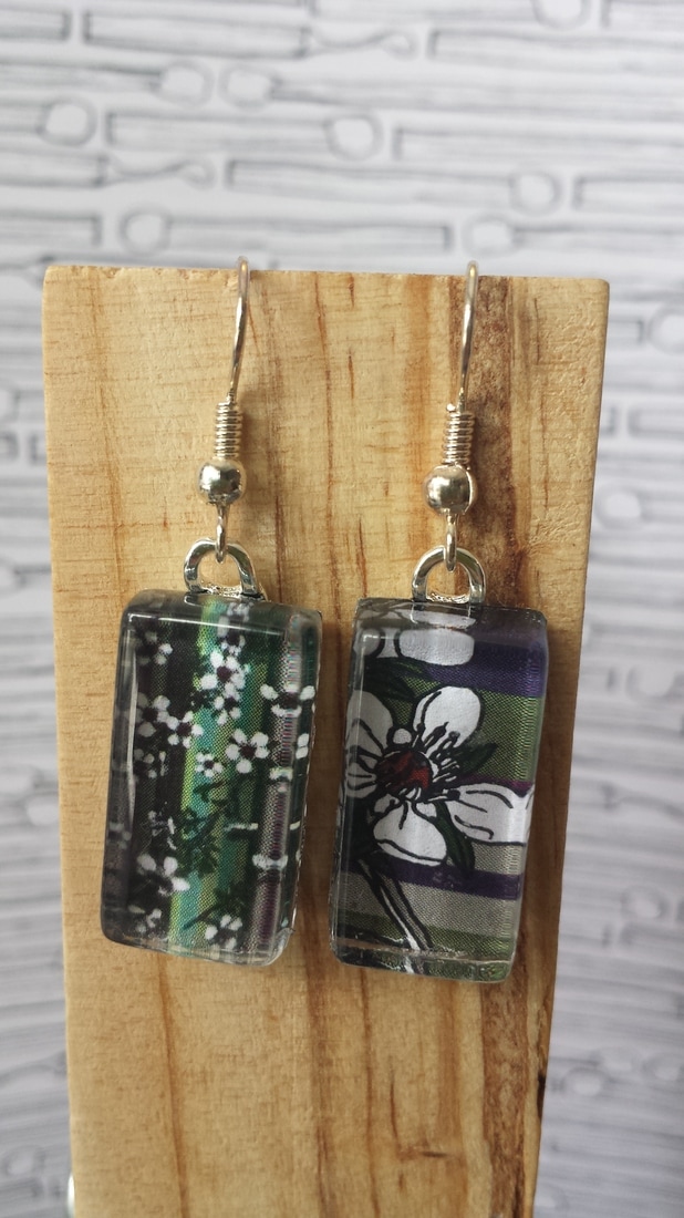
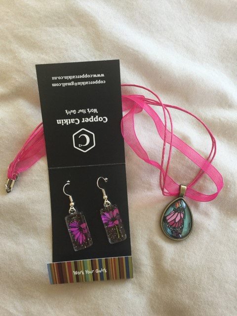
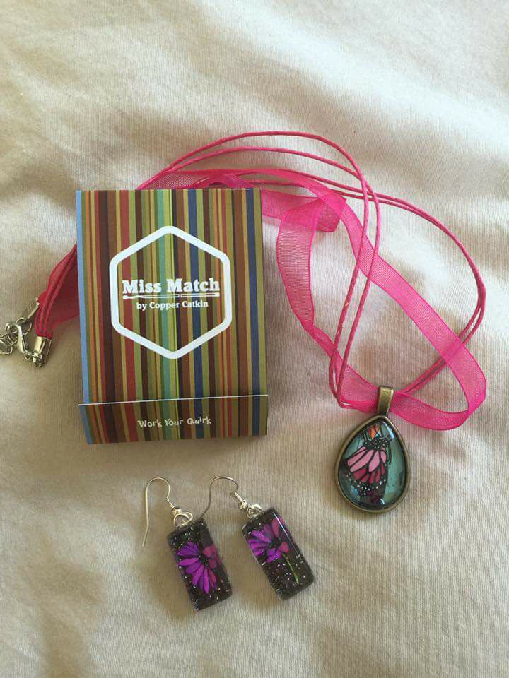
One of these things is not like the other one
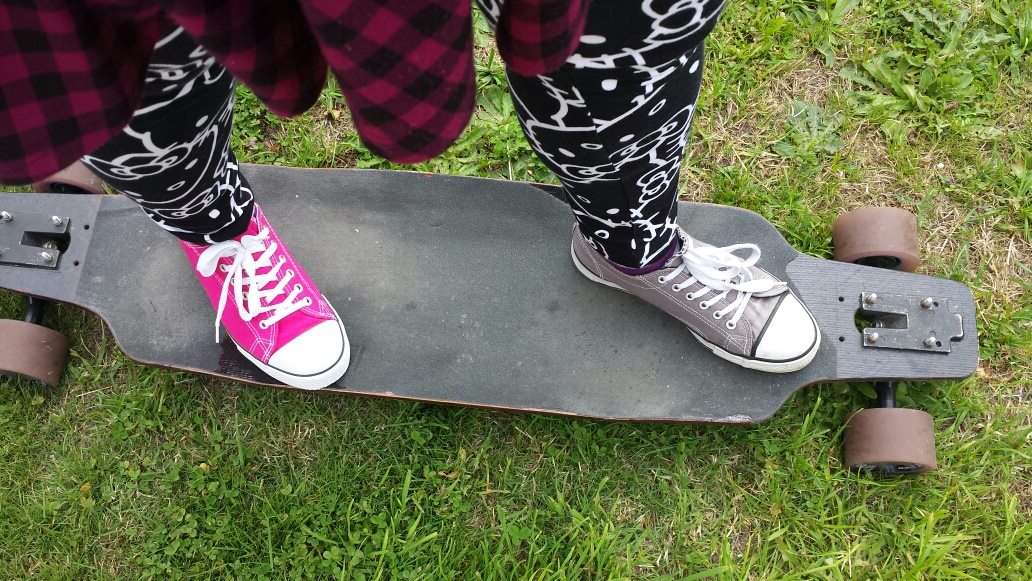
One of my personal quirks has always been which things should be matchy-matchy (cutlery and other homewares – I hate when my knife and fork are from different sets), and which things should be more eclectic. There are still rules, though; I need a unifying theme – for example, when I wear mismatched shoes, they both have to be sneakers, and the socks need to be from the same set (so that the thickness and fit isn’t weirdly different).
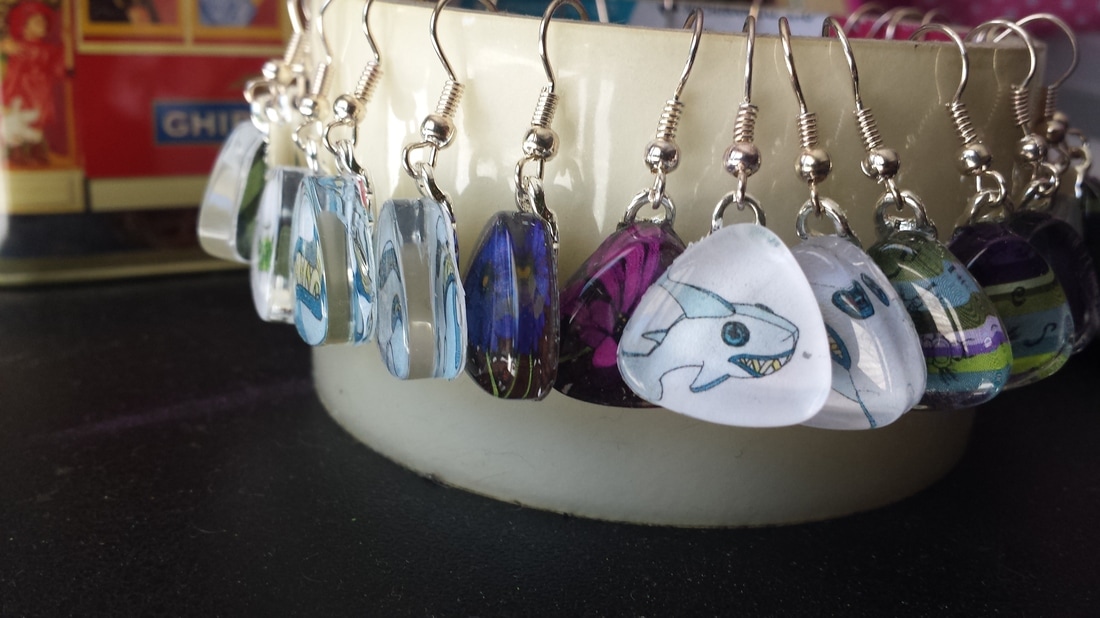
Part of the joy of the hand-making process is all the little imperfections that result from human intervention. I have deliberately embraced the fact that the images in my earrings will never be perfectly aligned, and now I’m taking it to a new, conscious level with the ‘Miss Match’ by Copper Catkin series.
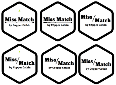
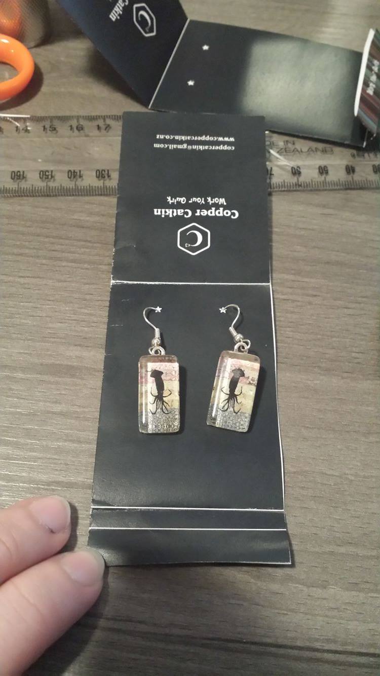
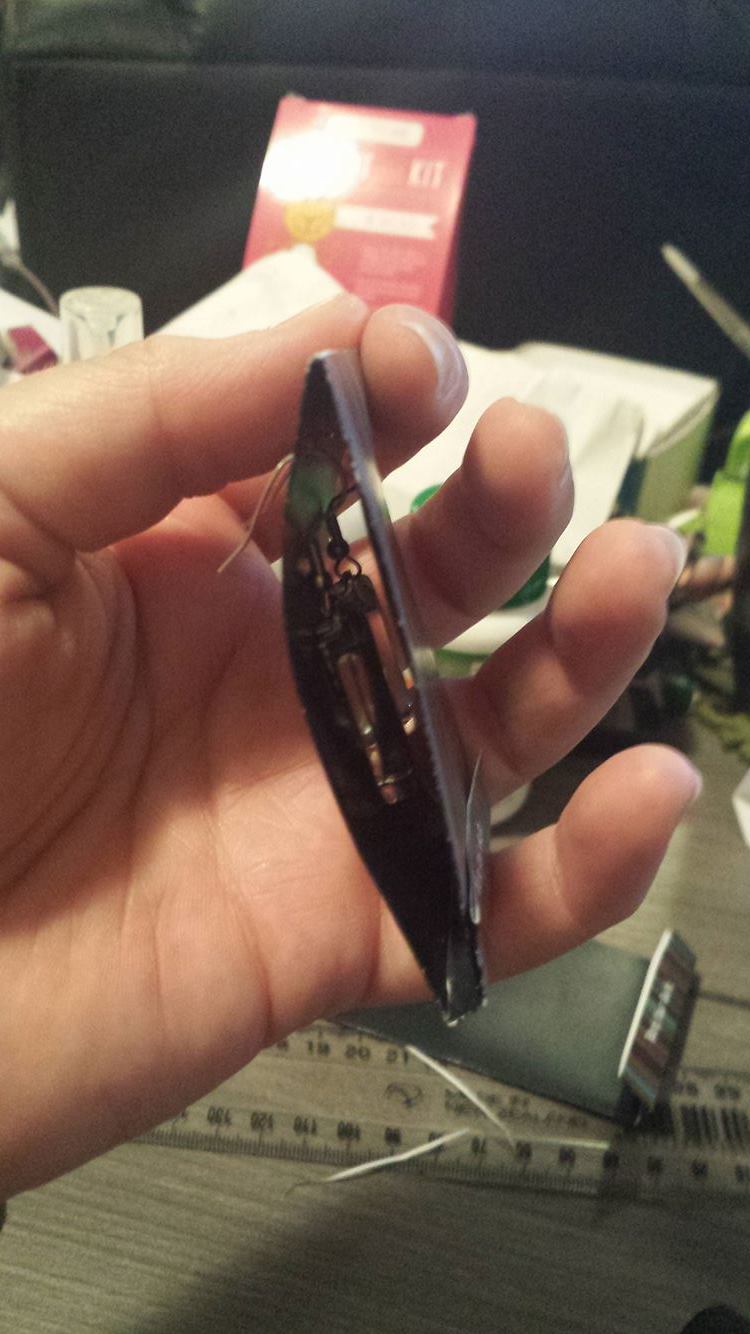
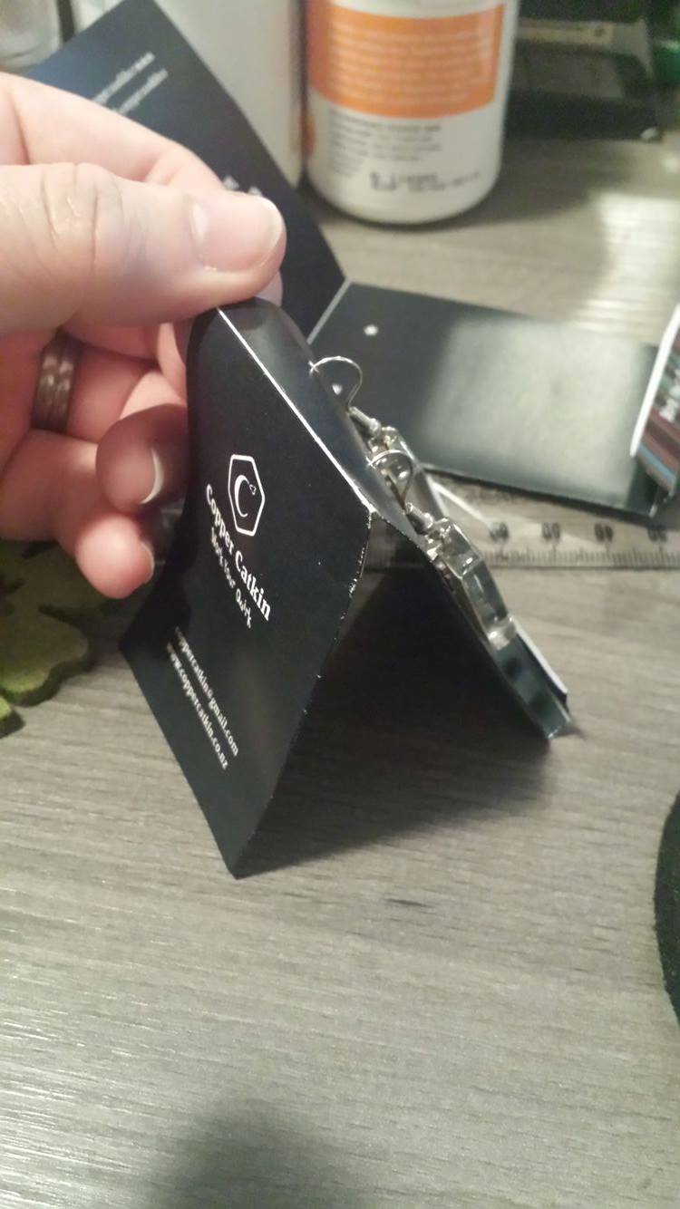
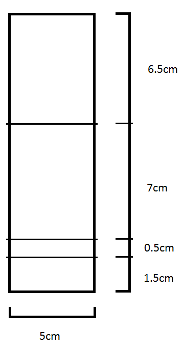
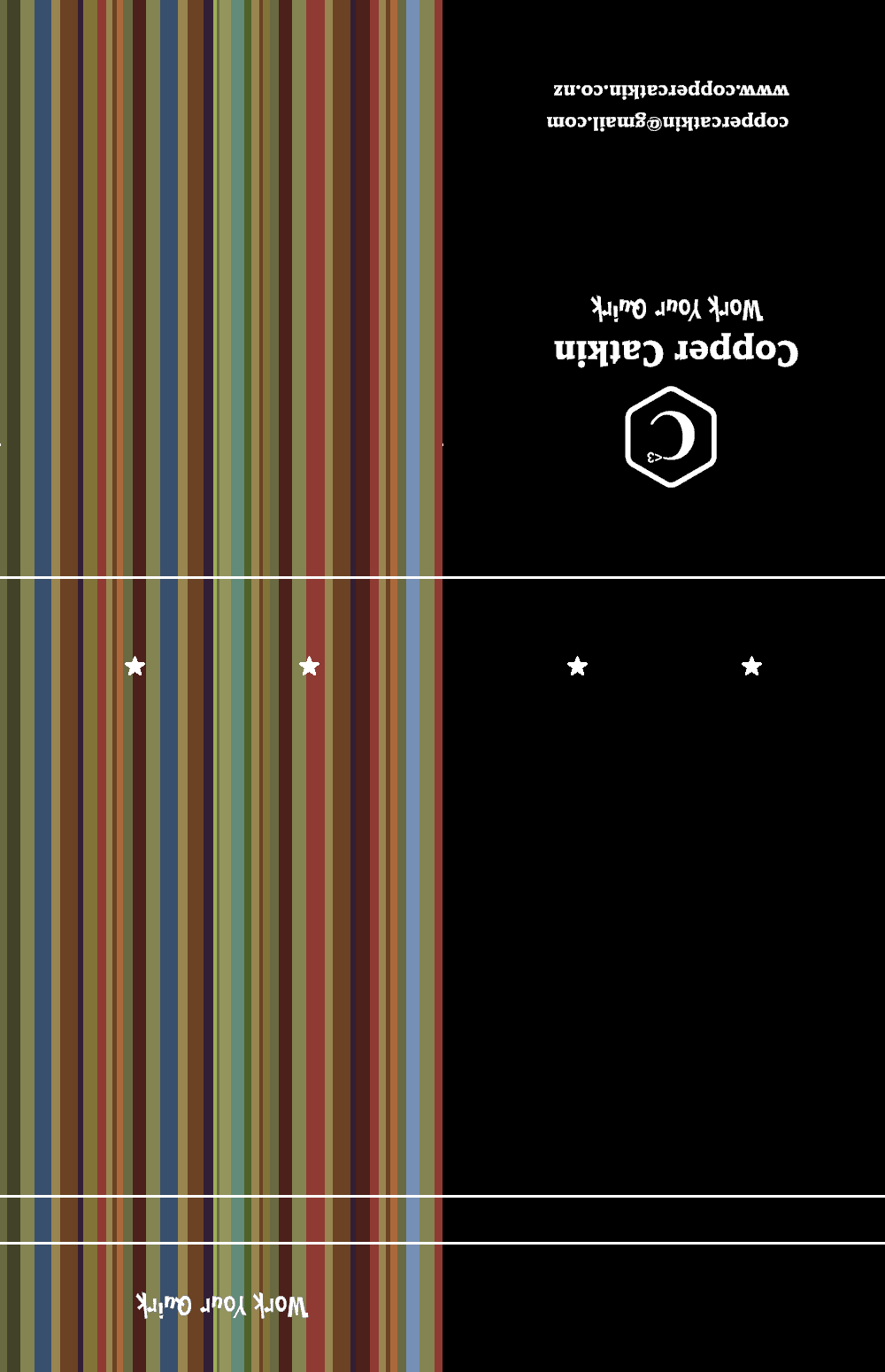
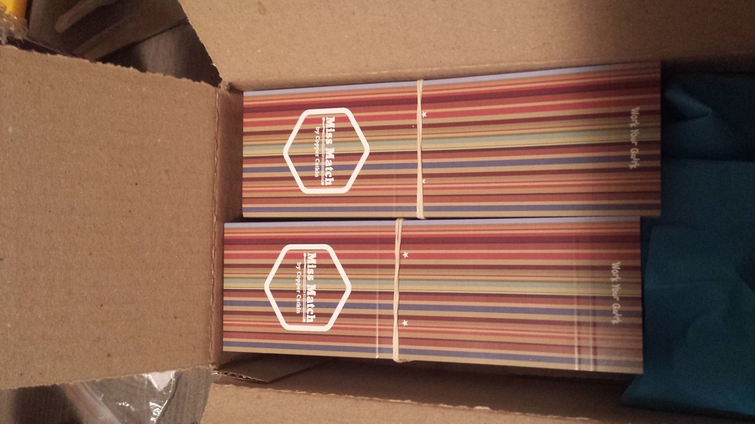
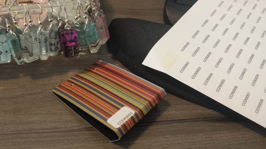
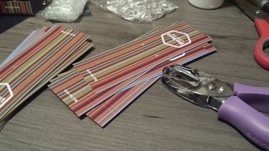
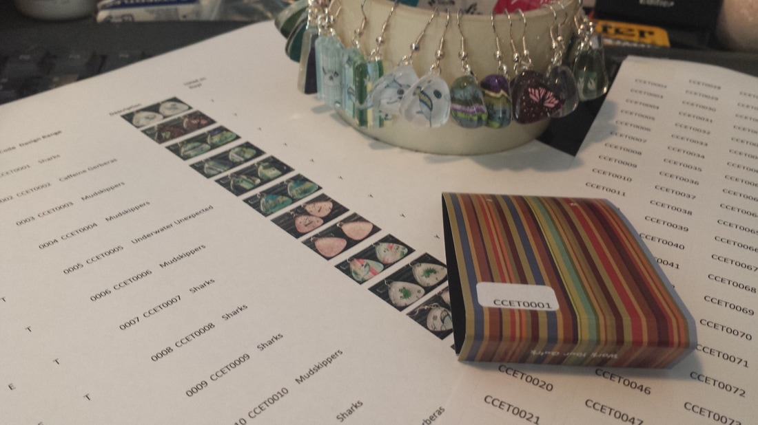
Designing the logo was quite a process, but I always had a strong idea for the final product – a matchbook that could flip open. I liked the idea of a matchbook from the very start – as well as the pun, it’s a different way of selling earrings. I haven’t seen anything like it, and combined with our new
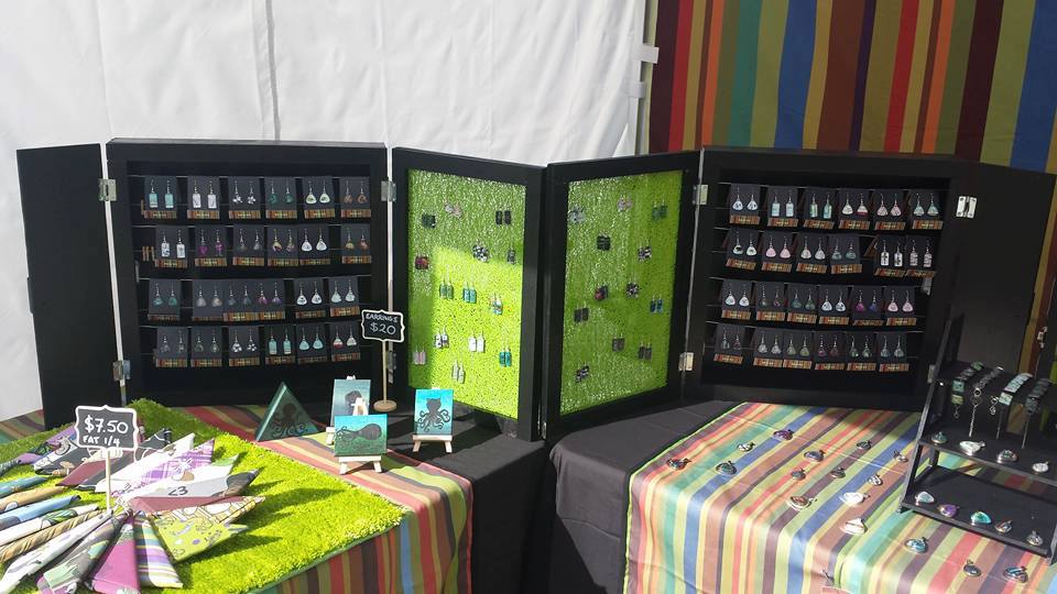
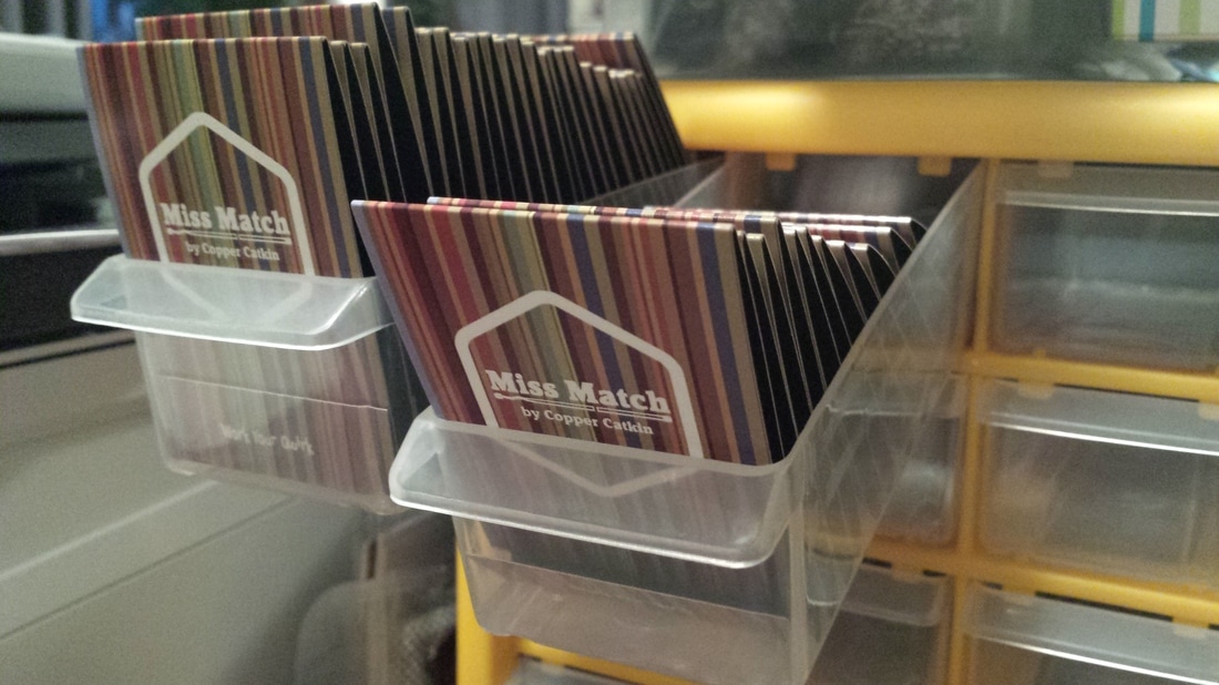
display units, it made the packaging much more accessible for people to pick up than our previous earring display, which was popular, but a little intimidating. People need help to unhook earrings from it, and that takes away some of their agency – no one likes to ask for help to look at things while they’re still browsing. It works really well in combination with our new earring displays, though – we also have Greg, the original display unit, where people can unhook ready-packaged earrings and pendants, which completes the set.
I mocked up the matchbooks as I saw them, and with the help of Cat from
Byte Design, I sent them out to get printed (very reasonably) at
Wakefields Digital.
I spent several hours folding the packaging and punching earring holes, then hanging my brand new earrings, and adding them to my new stocklist.
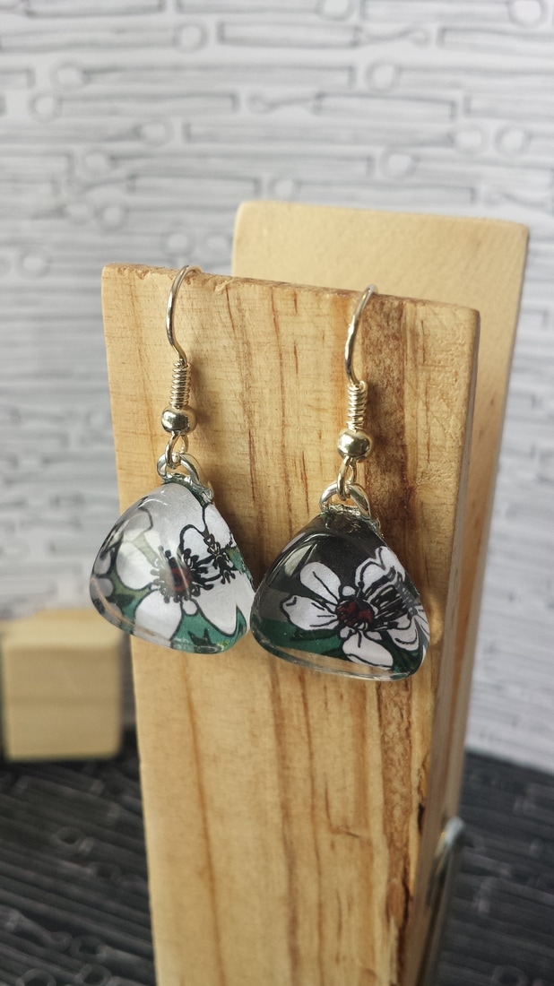
Look how great they looked on the new displays! <3
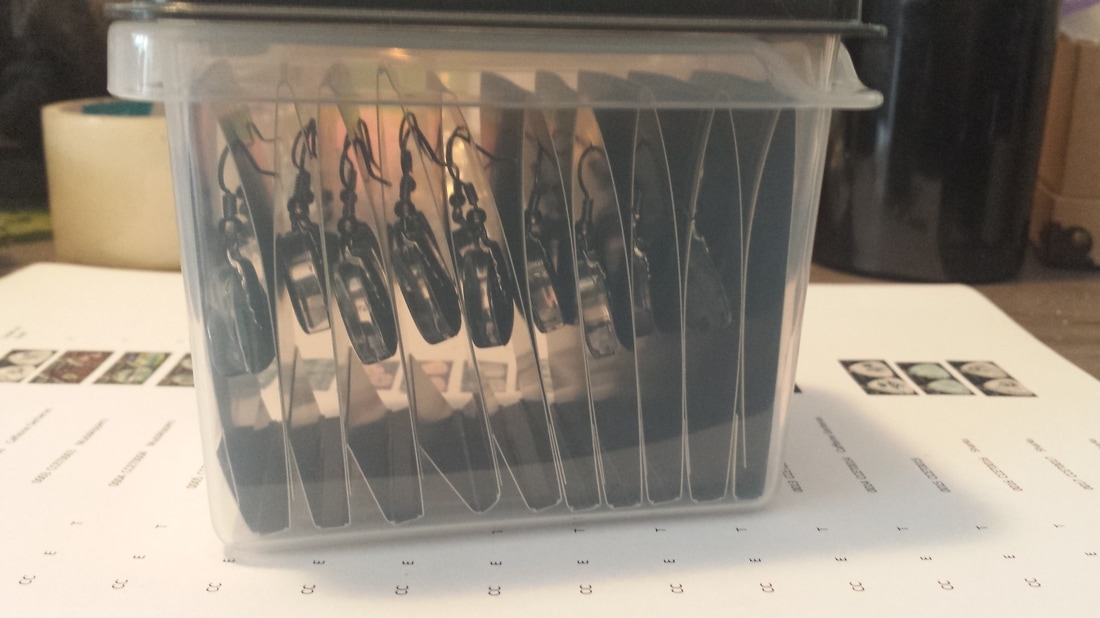
And here are some fan photos from a happy customer:
