Posted on Leave a comment

Ch-ch-ch-ch-changes

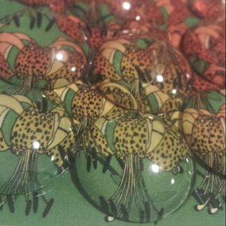
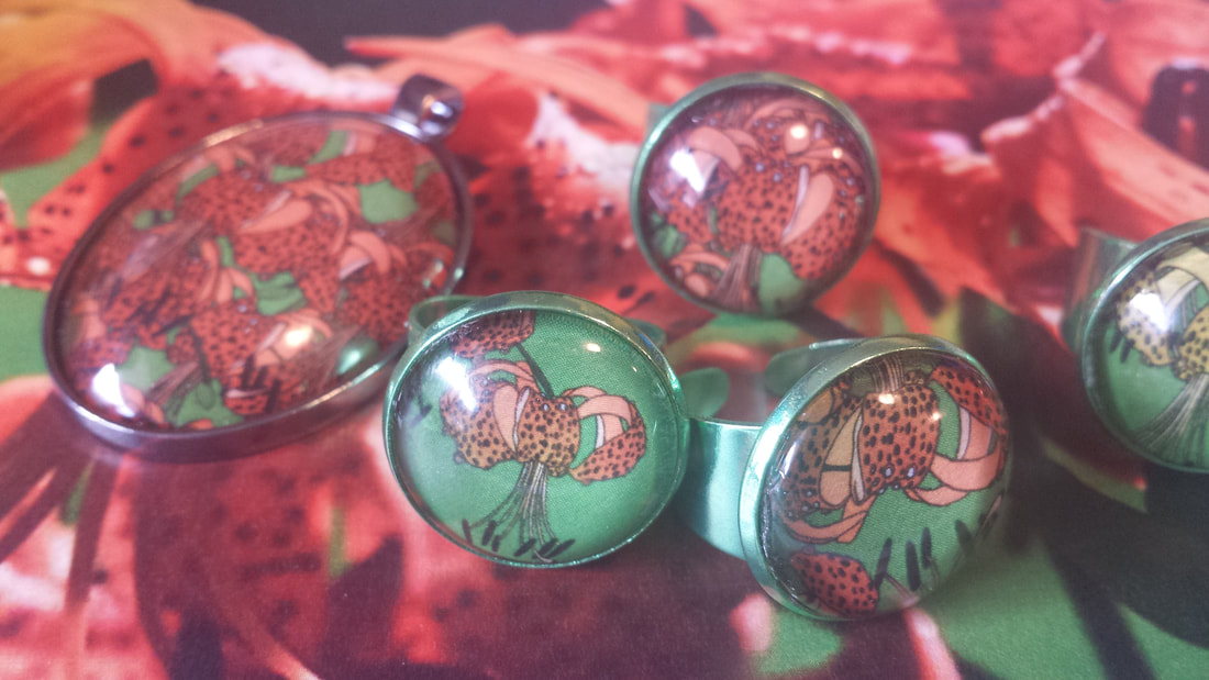
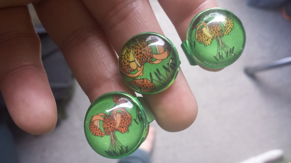
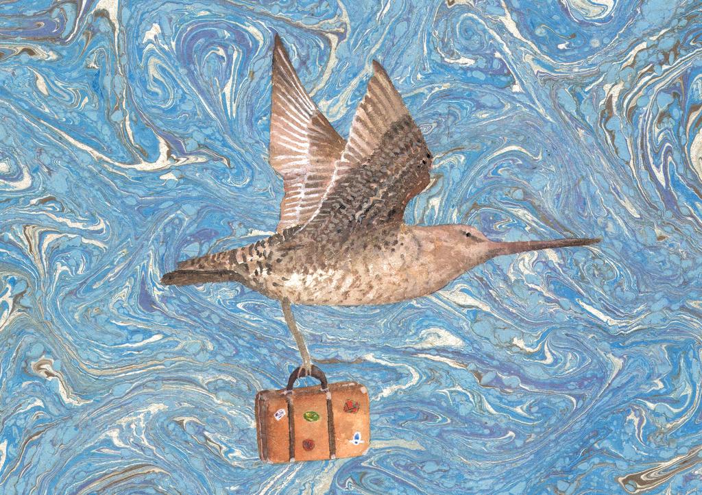
It’s been some time since my last Copper Catkin Consulting post – apologies! Life has been very busy recently – wonderfully so, but it all takes up time! I have been making some changes in my own life, and in my displays (as always), so I thought I would share one of my techniques with you.
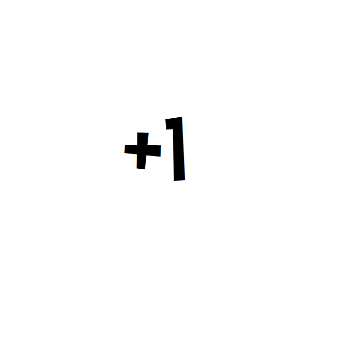
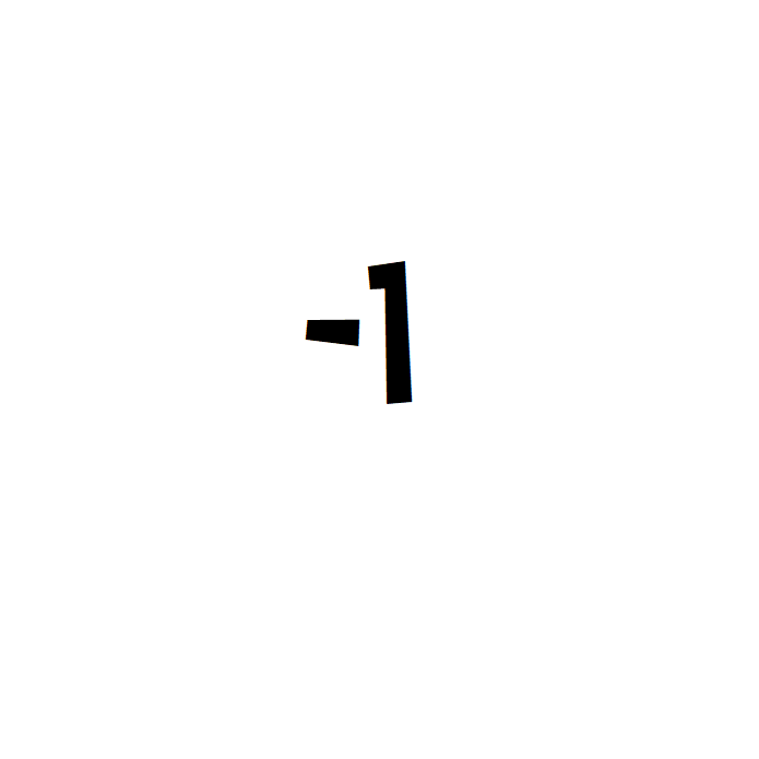
Add one, remove one

A while ago, I developed a technique for making small changes in my life (at whatever level) that has been a great help.
It’s a simple principle – add one, remove one.

How does it work?

Step 1 – make a list of all the small things you want to do more regularly – this could be as small as checking the mailbox every day for exercise, planning your outfit the day before to save time in the morning, or as big as a 5km run. Entirely up to you!

Step 2 – make a list of all the small things you want to do less – for example, buying coffee, having second helpings, spending too long in bed in the morning…

Step 3 – choose one to remove, and one to add. You can do a daily change, or a weekly change, or both – but make them sustainable, and incremental. For example, don’t quit coffee entirely in one go – remove on bought coffee a day. And don’t add huge changes, either – add one gym session a week, not 5.

Step 4 – every week, build on your progress – add another pair to what you’re already doing. If one becomes redundant, or too easy, upgrade it by ramping it up a notch, or replace it entirely.

Other applications

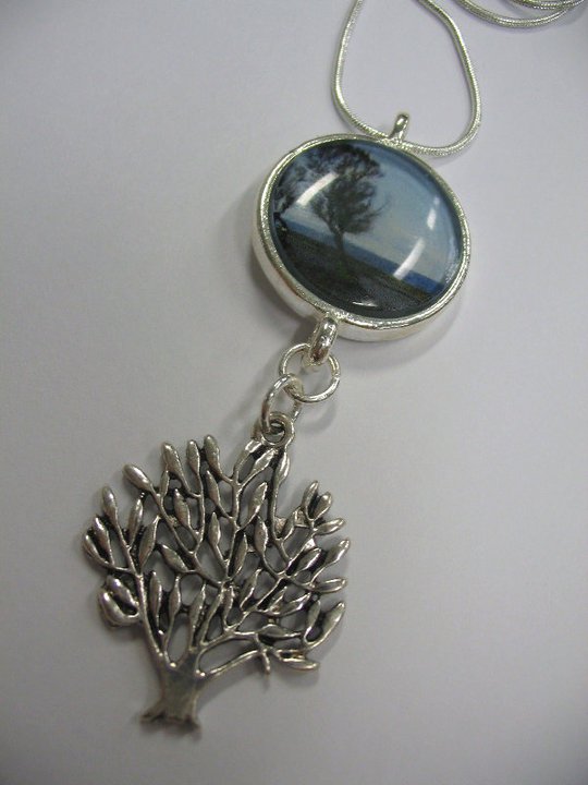
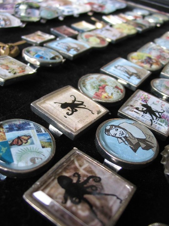
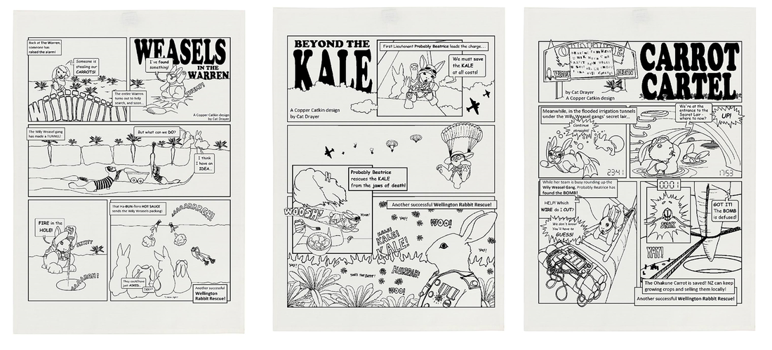
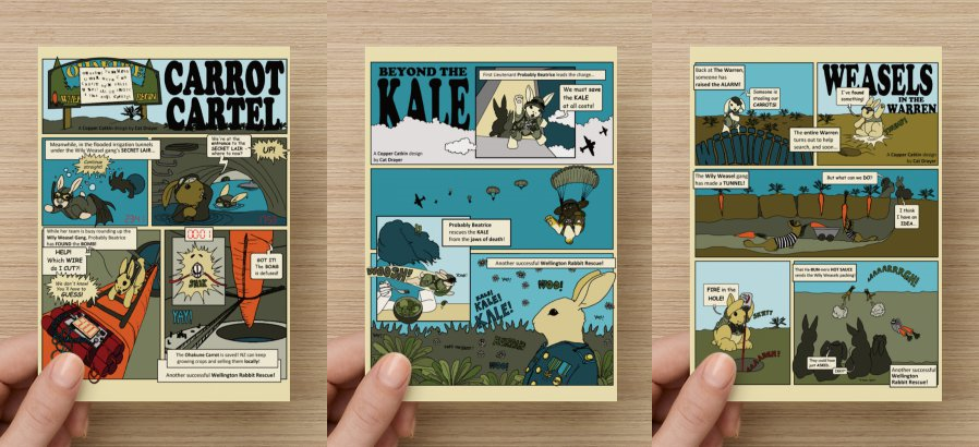
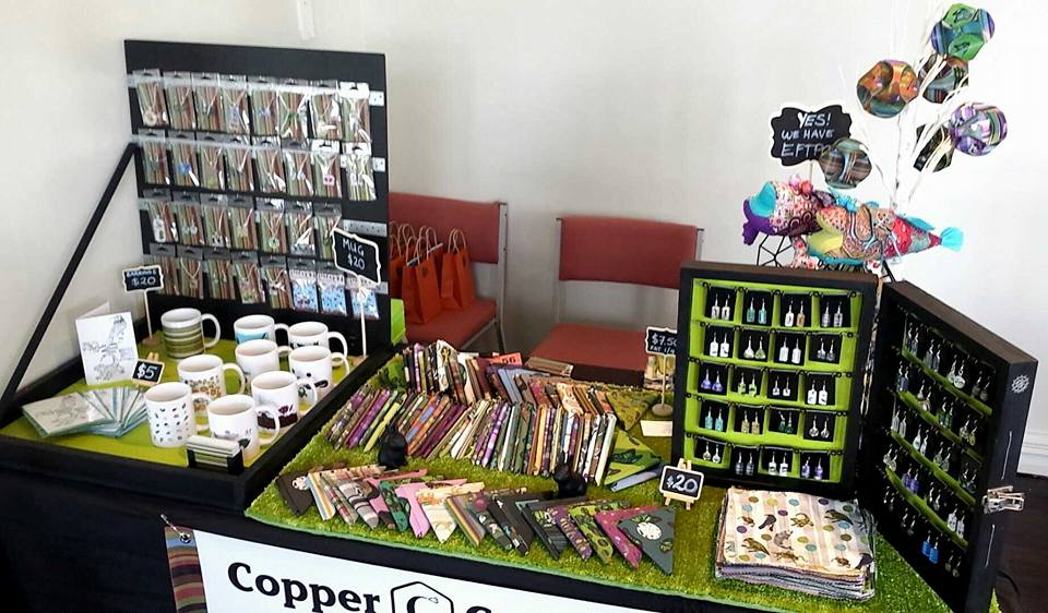
As crafters and makers, it’s easy to get caught up in all the creativity, and forget to maintain our stall itself. This is a great opportunity to apply these principles to your display.

Step back

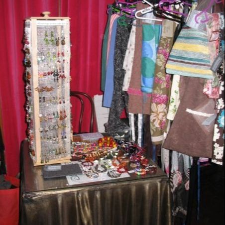
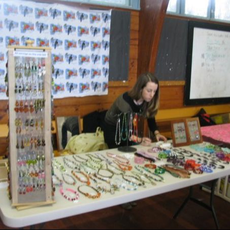
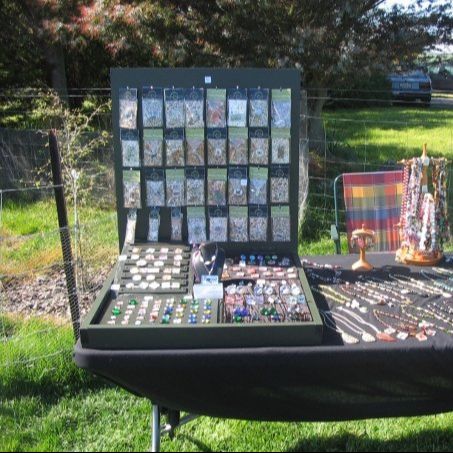
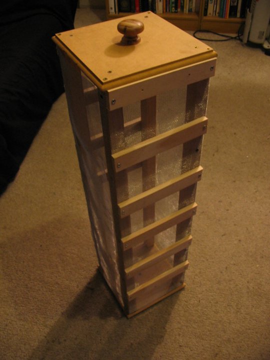
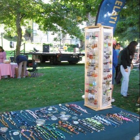
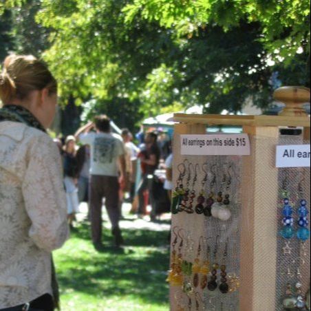
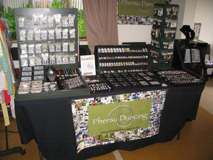
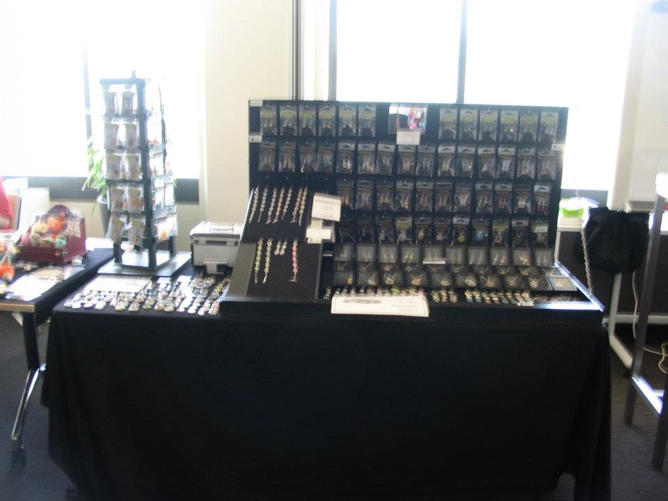
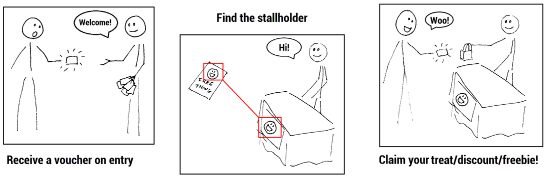
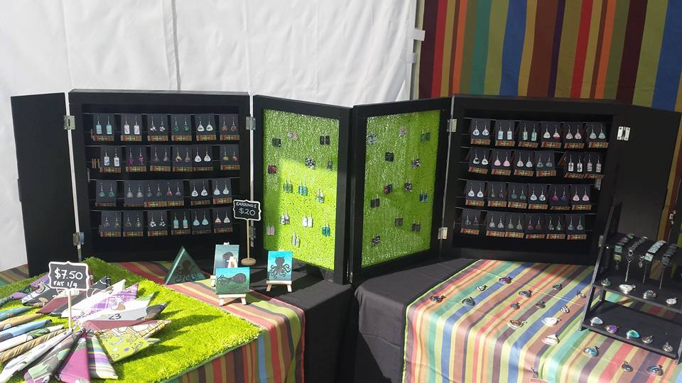
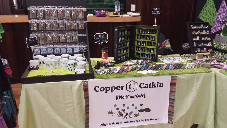
We all know about taking photos of our stalls every market, so it’s time to do the thumbnail test.
Look at your displays critically, and list the things you think you should improve. 
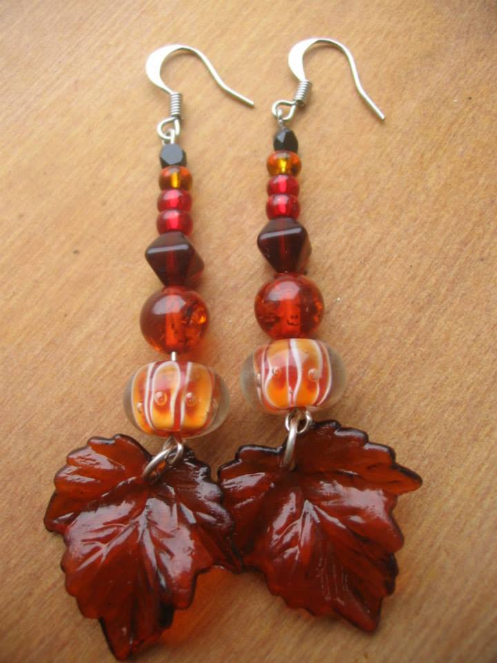
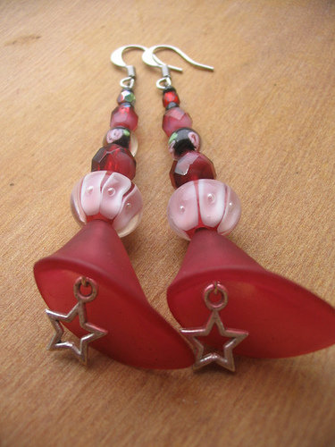
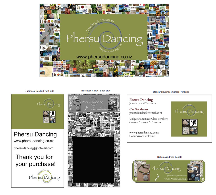
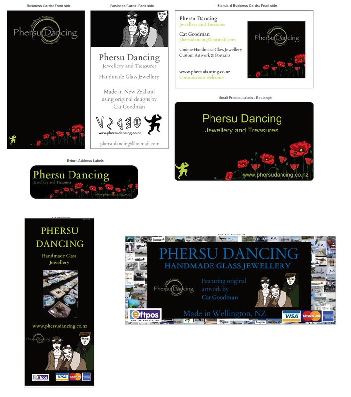
Add things to the list that you keep meaning to do – repaint that stand, fix that handle, reprint that sign, refresh your business cards…

Prioritise

Sort the list into ‘NOW’, ‘SOON’, ‘LATER’, and ‘NEVER’. You may not have anything in some of the categories – but use the priority to determine which elements are most urgent.

Declutter

There are always areas where we have too much of something. Do you have too many things on your table? How about your workspace at home or in your workshop? Do you have too many sales channels? Too many product lines? Do you spend too long on something? 

Assign a frequency

Your changes can be daily, weekly, or monthly – but they have to be fairly regular for this principle to work. If you have bigger jobs that you perform on an ad hoc basis, such as a major spring clean or a destash, use a Kanban board to track them – then you can put them back into the ‘to do’ list when they’re completed, until you need to do them again, or put them out of your mind entirely if they were a one-off task.

Match your add-and-remove options

Your remove and your add should really work together, to feel effective. They don’t have to be at the same frequency, though, for example:
​Remove: 
30 minutes of Facebook time-wasting per day
Add:
​30 minutes of Facebook post scheduling per week

Track

I like to track my success in a spreadsheet, but sometimes, as I’m only accountable to myself, I lose motivation. Post your targets on Facebook or in our stallholder VIP group, so we can help hold you accountable for staying on track!

Participate!

Stay involved – you really need to add a new pairing regularly until you reach the target – so if your target is weight loss, you should be adding and removing a new pairing every week until you have changed the bad habits into good ones – and then look for new pairings to help you keep going.
The same applies with your stall displays. Once your stall is looking its best, is there something else you can improve? How about your pack-in and pack-out processes? Does your car need a clean-out? This is also the time to look at new product lines, because everything is running like a well-oiled machine.

Share

Tell us what you’re going to do in the comments!
Posted on Leave a comment

Tiger Lily Design

The inspiration

As with my water lilies, this design was inspired by some amazing travel photos taken by my stepfather. I like to challenge myself to use new palettes, and these photos used beautiful shades of orange and green that I usually don’t incorporate into my artwork.
Some time ago, I ordered some ring bezels on a whim because they looked like they were going to be an amazing metallic lime green… but when they arrived, they were more of a blue-green. I put them away to wait for the perfect project – and here it is!

The design process

I’m working my way through old seasons of Project Runway, which I find to be great company for creating. In the episode that I was watching while I was drawing my tiger lilies, the designers were creating an outfit inspired by the botanic gardens, so that was fortuitous.
I sketched out the image quite quickly, and then got it coloured and printed, and the cabochons curing by the end of Season 5. The colouring process was interesting – as I mentioned, these are not my normal colour choices – but it came out even better than expected – and, fortuitously, an excellent match for my ring bezels!
My laser printer has been printing a kind of strange ombre effect recently – I think we may have accidentally stored some of the toner on its end instead of sitting flat. At first, it annoyed me, but I have actually come to really enjoy seeing the surprise effects – look how cool the printouts were!

I’ve got the goodies!

When I realised that I had exactly 20 ring bezels, I knew that these were the perfect treat to include in the goody bags for Craft Central this weekend. So they will be a strictly limited release, exclusive to the first 20 people through the door at 10am – if you want to get your hands on one, make sure you’re early to score a place in the line!
Posted on Leave a comment

Displays and Stands – a history

10 years of market displays

I’m going to take you on a tour of my market stalls and display units over the last decade. I started making jewellery in 2007. There were a lot of changes in my life – I graduated with my honours degree in 2005, then moved into full-time retail while I looked for a job that would justify my degree. In 2007, I moved from the shop floor to the office, and out of a job that gave me both the technical and creative balance that I needed. My first office job made me deeply unhappy, and then I started making earrings. A year later, I moved to a better office environment. This positive move led to my rediscovering my creative side. I started wanted to paint and draw again, and my jewellery-making ramped up.

What it says on the tin

When I first started making beaded earrings, I had no idea how to show them off – so I used a lovely old vintage tin. It was about 20cm in diameter, and I hung my little beaded earrings around the edge, until they were clustered so thickly that it was impossible to identify where one pair ended and the next began. It was time to find another resolution.

Welease Wodewick!

Roderick was a case of necessity being the mother of invention. I knew what I wanted, I knew my limitations, and I worked within those parameters. Roderick was all about being an earring tower for loose earrings; he was then followed by his brother, Frederick, who had panels with hooks, upon which I hung my packaged earrings and pendants.
Both displays come from the same simple design – an elongated box with a carrying handle on the top, wrapped in wire mesh, attached to a base with a lazy Susan. The whole upper segment rotates cleanly, and allowed me to use the otherwise wasted vertical space on the table.

Presentation, presentation, presentation

Like a Madonna of the craft market world, I am constantly reinventing myself. Here is a quote from a post from 2010, just after I built Greg (who is now 7 years young, and still going strong!) that talks about my evolution so far.
How you serve up your creations is just as important with crafts as it is with food.”
Picture

Greg (left) and Zavier (centre back).

Picture

Frederick (left) and Albert.

It’s not just packaging – it’s also about the display units. I built a variety of displays – Roderick and Frederick, then Greg, then Zavier (he’s Z-shaped). After that, I built Victoria and Albert. 
I have a couple of photos of Albert – but all my photos of that time period are locked on an inaccessible hard drive! I have no photos of Victoria that I can find, which is heartbreaking.
Posted on Leave a comment

A Retrospective – Phersu Dancing

A long and winding road

​Sometimes, it helps to look back at where you came from to help understand where you’re going next. Copper Catkin is only just over a year old, but I have been making things my whole life.
This post is a bit of a summary of how I got here – my ‘market cred’, if you will.

In the beginning

I started out with a bag of beads that I bought on Ebay for an ‘imaginary wedding’ – I worked in a call centre, and spent a lot of my time building daydreams to keep me sane. It ended up being really useful – I had planned so many imaginary weddings that, when it came time to plan my own, I had some great ideas all ready to go! My wedding was also a catalyst for my move into fabric design.

Phersu Dancing Jewellery and Treasures

​As any crafter knows, it’s a highly addictive – and expensive!- pastime. 
I started selling earrings from my desk at work to cover the cost of buying more beads, and in a few months, I had the stock to take on an Actual Market. It was time to come up with a brand name. 
I had recently finished my Honours degree in Classical Studies, so I decided to use the name of the obscure Etruscan figure which had been the topic of my research – Phersu, from the Tomb of the Augurs in Tarquinia, Italy.

Branding

My branding went through several iterations, over the years. It started out inspired by Etruscan lettering, and using the silhouettes I had developed as part of my thesis.  These remained a constant throughout, even as the fonts and design concepts changed.
I took a hiatus when my job became too demanding for Phersu Dancing to feel like anything other than work (which was just awful). I had my whole look refreshed and redesigned – and then decided to launch Copper Catkin instead. Sigh. It looked amazing, though!

Products

I started off making beaded earrings and necklaces, but I got frustrated with being unable to add my personal touch to the beads. I didn’t have the budget to become a glassblower, or to learn to make beads in other ways, so ​when I stumbled across glass cabochons, I knew I had found my niche. Back then, there were very few people making that sort of thing – and those who did, used resin. My beautiful glass pieces stood out from the crowd, and I gained a loyal following of market regulars.
I started out using ephemera, and then my own photos and collages. I started to use my own artwork when I noticed that others were starting to do similar things (especially with the generic ephemera). I created several ranges of drawings – my Aviatrices for airshows, my DisDerbya Roller Derby Zodiac series (inspired by a craft swap challenge), and my Maori women range (inspired by the gaps in my own knowledge about NZ women).

Displays

because of my prolific making, my stock had already outgrown the tin that I used as a display on my desk, so I built myself a rotating display, called Roderick. I used pre-cut MDF squares from Spotlight, a lazy Susan base from Craftrunner, and timber and wire mesh from a hardware store (I can’t recall if Bunnings was in NZ yet at that point, but I think it was). I had a power drill and a small jigsaw, and I channelled Tim Gunn without knowing it – even though I had very little experience in carpentry of any sort, I Made It Work. I talk about my displays in another post.
Picture

First ‘real’ market, Mighty Mighty, July 2008 – shared stall

Picture

Frederick, one of the earring displays that I built

Phersu Dancing in the community

Picture

Custom design for Feltaid fundraiser pieces

I participated in Felt Aid, to help raise funds for Christchurch after the first earthquake (September 4th, 2010). I donated my own pieces, from an artwork I created especially for the initiative, but I also donated a lot of time as a volunteer administrator of the Feltaid store. It was a great deal of work, but it was also hugely rewarding. We revived the store again after the second, bigger earthquake on 22 February 2011.
Picture

DomPost article Capital Times, A11, Dominion Post, 17 September 2010

Another fundraiser initiative was to help a good friend get to Australia to see a specialist for her rare illness – Dercum’s Disease. Together with several others, we were able to raise enough to help pay for airfares and accommodation.

The start of Copper Catkin

Last year, I helped Wellington Rabbit Rescue raise the funds required to cover printing costs for a range of fundraising merchandise to help cover vet bills.
I created the artwork, including curating all the merchandise items and managing the funds, organised the filming of a Fundrazr video, organised a craft market event to launch the campaign, including an appearance by Mojo Mathers, MP.
​We successfully raised funds to cover more than the amount required, and my designs are still being sold today. Because we covered the costs in the Fundrazr campaign, 100% of every sale goes straight onto the vet bills, to help WRR help the bunnies.
The impetus to draw and make things from my drawings continued from there, and continues to this day. 

Copper Catkin Consulting and Petone Winter Markets

As well as selling my own creations at craft markets, I also decided to launch a side-business to help stallholders improve their displays. So many people loved the displays that I build, and the way that I have a point of difference from other stalls. Copper Catkin Consulting was born.
My clients were interested in ‘coaching’ markets, so I started to explore the possibility of running small markets. The aim was to offer pre-market coaching, with a post-market debrief – but the Petone Winter Markets turned into a full-blown craft market instead, and this first series of three (July, August, September) was surprisingly successful. There is such a lack of events in the Hutt valley that there were more than 80 more applications than I could accommodate.  I hope to find a suitable venue to offer 6 indoor markets in 2018 – April, May, June, July, August, and September.
In the meantime, as it is definitely no longer winter, I have launched my new markets, Wrought.
Posted on Leave a comment

Spoonflower Design Challenge – Block Print Teatowel

What does Kōwhai mean?

“Kōwhai (Māori pronunciation: [kɔːɸai] or [kɔːfai]) are small woody legume trees within the genus Sophora that are native to New Zealand. There are eight species, with Sophora microphylla and S. tetraptera being the most recognised as large trees. Their natural habitat is beside streams and on the edges of forest, in lowland or mountain open areas. Kōwhai trees grow throughout the country and are a common feature in New Zealand gardens. Outside of New Zealand, kōwhai tend to be restricted to mild temperate maritime climates.
The blooms of the kōwhai are widely regarded as being New Zealand’s national flower, although they have no official status as such.
The word kōwhai is also used in the Māori language for the colour yellow, because of the colour of the flowers.”
From Wikipedia.

Botanical Block Print teatowel – the brief

Do you spend your weekends venturing to local botanical gardens, dreaming of the next oversized houseplant to make its way into your home? This week’s challenge will be the cure to your leafy green obsession. While you are not required to block print for this challenge, your entry should be inspired by the block printing technique. Find inspiration and learn more about this time -honored technique from block printer and Spoonflower designer, Rochelle New. Entries will be submitted at the Linen Cotton Canvas fat quarter size (27″ x 18”) but previewed during voting as a Spoonflower Special Edition Tea Towel (16″ x 24″). Submissions close October 10, 2017 at 3 p.m. eastern daylight time. Voting begins October 12, 2017. See official rules.”
From the Spoonflower blog

​Kōwhai and me

The kōwhai is one of my favourite natives. Our place has at least a dozen trees planted around the house, attracting many wonderful native birds to drink the nectar and serenade us. I’ve played with different kōwhai designs over the years, but I’ve never got around to making anything. I have also played with lino cutting, but I have bad OOS and can’t handle the scraping.
I started out making a lino cutting for this challenge, then I re-read the description.
While you are not required to block print for this challenge, your entry should be inspired by the block printing technique”.
I put down away the lino, and picked up a pencil. I’ve done enough lino cutting to understand the technique, and how to represent it – and I think it was quite successful!

My entry

I chose to represent the print as a honey-yellow on a black background, because the richness of the yellow demanded a black background, and emphasised the ‘hand-cut’ effect.
As always, ​I hope that you will vote for my entry when voting begins! 
Here it is on Spoonflower now:
Posted on Leave a comment

Spoonflower Design Challenge – Family Recipe Teatowel

Chocolate Lemon Slice

So in our family, Chocolate Lemon Slice is an absolute treasure. It’s not exactly hard to make, but it’s time-consuming – and it gets eaten so fast! So it’s a special occasion treat. 
When I saw that one of the October Spoonflower teatowel challenges was about family recipes, I was thrilled! While we were at the family bach in 2014, I considered making a teatowel using a drawing of the lemons on the tree and mum’s handwritten recipe, but I never got further than a quick ideas board. This challenge was a great chance to revisit the design and make it work, as Tim Gunn would say!
Some time ago, while we were in Geneva, my mother chaired a Cookbook Committee for the American Women’s Club of Geneva. Although it was purportedly for American women, in practice, many expats from all over the world were involved – and my Kiwi mum was in charge! For those who know her, this will not come as any kind of a surprise. She’s the source of my organisational skills.

Chocolate Lemon Slice – the recipe

Base
 
1/2 cup (120g) butter
1 cup (120g) powdered sugar
1 egg
1 1/2 cups (180g) flour
1 teaspoon baking powder
 
Cream butter and sugar; add egg, then beat again and add flour and baking powder. Press into a greased 10×14” (25x35cm) pan. Bake in a 350°F (180°C) oven for 15 to 20 minutes. When cool, cover with filling.
 
Filling
 
4 tablespoons butter
1/2 cup (60g) powdered sugar
2 tablespoons sweetened condensed milk
grated rind and juice of 1 lemon
 
Filling – method:
Combine butter, powdered sugar, sweetened condensed milk, and lemon rind and juice. Heat until smooth and pourable. Cover base and leave until set. When set, cover with icing.​
Icing
2 cups (240g) powdered sugar
2 tablespoons cocoa
1/2 teaspoon vanilla
2 tablespoons butter
2 tablespoons water
 
Icing – method:
Mix powdered sugar, cocoa, and vanilla in a bowl. Bring butter and water to a boil and add to powdered sugar mixture. Beat until smooth.
Drizzle over filling and smooth out as much as possible – don’t worry if it’s a little uneven. Cut into squares to serve. Makes about 30 pieces.
 
The squares keep well in an airtight container – if they last that long!

The design

I took the original drawing that I did at the bach three years ago, redrew it on a larger scale (with finer lines), drew some extra lemons, and created a background.
Then, I typed up the recipe (another reason to have it on the blog, lol), coloured in my lemons, and tadaaa! Ready to go 🙂

Family Recipe teatowel – the brief

“Family traditions are especially present during the holidays as everyone gathers in merriment and celebration around the dinner table. For this week’s challenge, share a family recipe that is a yearly staple. Whether it’s Grandma’s famous casserole or the wiggly fruit jelly salad that mysteriously makes an appearance, we want to see what recipe completes your holiday traditions! Entries will be submitted at the Linen Cotton Canvas fat quarter size (27″ x 18”) but previewed during voting as a Spoonflower Special Edition Tea Towel (16″ x 24″). Submissions close October 3, 2017 at 3 p.m. eastern daylight time. Voting begins October 5, 2017. See official rules.”
From the Spoonflower blog

My entry

I hope that you will vote for my entry when voting begins! 
Here it is on Spoonflower now:
Posted on Leave a comment

Spoonflower Design Challenge – calendar teatowel

I print my fabrics through Spoonflower, an amazing and unique service that allows designers to upload their digital designs and print short runs in a range of fabrics, gift wrap, and even wallpaper. Through their sister companies, Roostery and Sprout, designers can make their designs available as ready-to-sew patterns and homewares.

Spoonflower fosters a great community of creatives, and one of the ways that they do that is through their weekly design challenges. I have set myself the target of entering as many challenges this month as I can.

2018 Calendar Teatowel – the brief

Ring in the new year with a favorite Spoonflower design tradition: Tea Towel Calendars. Celebrate 2018 (the year of the dog!) with a tea towel calendar design for the new year ahead. Need a little design kick-start? Find a 2018 calendar template here!* Entries will be submitted at the Linen Cotton Canvas fat quarter size (27″ wide x 18” high, landscape orientation) but previewed during voting as a Spoonflower Special Edition Tea Towel (16″ wide x 24″ high, portrait orientation). Submissions close September 26, 2017 at 3 p.m. eastern daylight time. Voting begins September 28, 2017. See official rules.”
From the Spoonflower blog

Subject matter

I’ve been following the posts of the ​Island Bay Marine Education Centre for some time now, and I just love all the photographs that they share. One of their star creatures is the magnificent Fabio the octopus. 
I mean, seriously. Just LOOK at him. He’s amazing. You can visit Fabio and all his friends every Sunday from 10am to 3pm until 17 December 2017.  The Centre will re-open on Sunday 21st January 2018.

Fabulous Fabio 

I had so much fun choosing and sketching portraits of Fabio. This is the final drawing – I love the movement that the tentacles give him – almost like a dramatic, Dracula-cape flourish. 
I combined Fabio with some elements from my Rockpool design range to create my colourable teatowel entry to the competition. The drawing’s the thing – I don’t mind at all where I place. It’s more a case of getting it done. 
Looking forward to seeing the other entries!
Posted on Leave a comment

Goody Vouchers II – the return

Picture

Our new Goody Voucher concept went brilliantly in August, so we’re happy to announce that they will be available again in September! All you have to do in come in the door, do the lollipop luck dip, and see if you have won a voucher! Then, hunt down your stallholder and claim your gift, treat, or discount! #simple
Picture

What could be on my voucher?

Freebies, discounts, treats with purchase, and more! Follow us on Facebook and find out! Watch this post…

What time are the vouchers available?

Come in the door between 10.30-11, and between 12.30-1, while vouchers last!
See you at Petone Winter Markets, 16th of September, 10.30am to 3pm!
Posted on Leave a comment

An interlude with Dora Papers

Meg Prebble from Dora Papers is one of our wonderful stallholders at Petone Winter Markets – but that’s not all she does! She teaches, makes, and has exhibitions, and her work is instantly recognisable. Let’s get to know her a bit more today.

An Introduction to Meg

Kia ora, 
I’m Meg Prebble, I’m an artist and crafter who loves working with paper. I make a wide range of things – from mini book earrings to metre-tall pohutukawa trees, marbled papers and pop up cards. The two unifying factors are my ongoing fascination with the possibilities of paper, and the native bush and birds of Aotearoa NZ.

How did Dora Papers come about?

The origins for Dora Papers came from the earrings I made for myself. I’ve always loved working with paper, enjoying both quilling and marbling as a child. A few years ago I made a range of these wonderfully lightweight paper earring for myself, and it just made sense to share them with others. Of course I needed a name, and chose to recognise the woman who always inspired and encouraged my art and craft – my grandmother, Dora Bagnall. I’ve branched out a lot since those early days, and have continued to develop and refine my paper art techniques.

The Paper Art of Meg Prebble

I have an exhibition on! The Paper Art of Meg Prebble opens at Alfred Memelink’s Artspace Gallery in Petone on September 9th, and runs until October 8th. 
A range of my work will be on display, including paper plants big and small, life-sized bird paintings in watercolour and marbling, and marbled bird earrings the size of a thumbnail.

​What are you working on now?

Right now, writing this in the week leading up to the exhibition, I’m finishing the last few bits of work for it, with some cabbage tree branches to go. I also have a number of hot air balloons and dirigibles in various stages of completion currently cluttering up my table – look out for them at the next Petone Winter Market, September 16th!

What were the exhibition details again?

The Paper Art of Meg Prebble opens on 9th September, and runs until October 8th. At the Alfred Memelink Artspace gallery on the Petone forshore, which is open Tues-Sun, 10-5. I hope you stop by for a look, and if you want to say hi to me come to the opening, September 9th 2-4pm.

Where can we find out more?

Find Dora Papers on Facebook:
https://www.facebook.com/DoraPapers/
Find Alfred Memelink on Facebook:
https://www.facebook.com/Alfred.Memelink.Artist/
Find “The Paper Art of Meg Prebble” event on Facebook
https://www.facebook.com/events/474401359583103
Or come and see Meg at Petone Winter Market – September​:
https://www.facebook.com/events/1790237141305899/
Posted on Leave a comment

A little light-hearted Halloween fun

Why Halloween in NZ, though?

So the other day, I noticed that craft shops here in NZ already have Halloween decorations for sale. One part of me rebelled – it’s an American tradition, and it’s not something that has ever been a big deal in NZ. But then I thought about the fact that I have an international audience, and Halloween is certainly fun. And when Spoonflower’s Vintage Halloween Design Challenge came through, I thought, “why not?”, and posted an Inspiration Competition on my Facebook page. I do these periodically to stop myself from getting too complacent – it’s fun to challenge myself to draw what people suggest, too!
Picture

A very small me, hollowing out an enormous pumpkin in Switzerland.

There were a lot of good suggestions, so while I waited for them to percolate through and see if a design came out, I decided to revisit an old drawing style from my secondary school years.

The days of the old school yard

I was lucky enough to attend International schools as a child – and it was a real culture shock to step back into the NZ school system in my second year of secondary school. It really felt like putting on the brakes – and art class was no different, although it seemed promising at first. In my first year back, we had a wonderful art teacher, Mr. Coke, who called me ‘My Good Man’ as his running dad-joke (my maiden name is ‘Goodman’). He was an excellent teacher. Unfortunately, we got another teacher for the next year. I don’t know what was going on with her, but several of the other students suggested that she drank. She certainly spent a lot of time in the back room, although I never remember her smelling of alcohol. It was a frustrating time – we weren’t allowed to go and get supplied ourselves, we had to ask her – and she would come back, a solid 5 minutes later, with something completely different. 
She was also not terribly inspiring. We spent most of our time with the uninspiring choice of glass bottles or gourds as a still life. It was School Certificate year, so we were very driven and busy, and our work was guided by the need to finish the year with a portfolio and workbook – so we had other distractions. 

Please – no more gourds…

Sixth form was internally assessed – and didn’t have a portfolio requirement. The pressure was off – but the gourds? The gourds were still there. It felt like month after month, we had nothing but them to work from – so I got frustrated, and started adding some surrealist touches to my (bored) painting. I eventually decorated my portfolio cover, and my chest of drawers, with these fairly silly, if somewhat menacing, designs.

#TBT

Given that, what with the Halloween design I was mulling, there were probably going to be pumpkins in my near future, I decided that it would be fun to revisit the fanciful gourds-with-faces motif.
So that was fun – and this design is now available in my Spoonflower shop 🙂

Halloween inspiration challenge winner

Now that I had taken some time to think and draw, I went back and read through the entries for my competition – and one stood out, both for originality and humour.
Of course, this was a must-draw, even if I couldn’t necessarily do the idea justice. I did a bit of research on poses, then got drawing. 
I used the colours from my new ‘Halloween Stripe‘ design, and leaves from my ‘Autumn Bouquet‘ range, and the jack-o-lantern pumpkin from the sketch itself.
This design has now been added to my Halloween series, and once our proofs arrive, it will be available for sale in my Spoonflower shop, too!